Adding error bars to averages

A batting average is a record of what a player has achieved. The fewer matches played, the less meaningful that average. I propose an approach to estimate the range of possible long term averages a player might have, based on their current average plus the number of innings played. I’ll talk about Mark Ramprakash too, just to keep things fun.

Imagine a new batsman on the scene. Assume we magically know they have the technique to average exactly 30. By using a Monte Carlo simulation, we can see the paths their average might take by chance.*

Fig 1 – Expected range of averages after 15/30/100 innings. Even after 30 innings a player’s data may not reflect their talent, with 1% averaging 20, and another 1% averaging 40- just through luck. Curves should be smooth but I only ran the simulation 150,000 times, causing some noise.

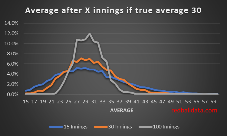
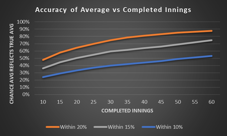
By embracing the uncertainty in averages we can better interpret them. Using the simulated data, we can estimate the uncertainty (standard deviation) of a player’s average once they have played a given number of games.**

Fig 2 – Standard deviation in batting average as a function of innings played and average. Note that 68% of results lie within one standard deviation of the mean, and 95% within two standard deviations. Also note the rapid reduction in uncertainty during the first 40 innings.

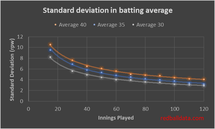
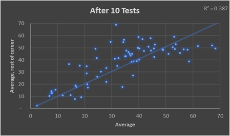
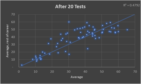
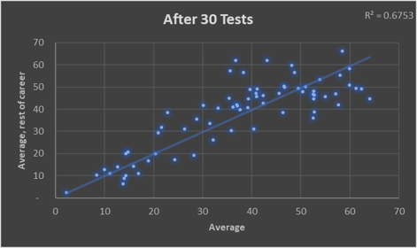
A standard deviation of 10 means a 95% chance the true average is within 20 runs of the observed average. That’s where we are for a top order batsman after 15 innings: it’s too early to use the data to conclude, though qualitative judgements on technique are possible.

There are four practical uses for this analysis:

1. Identifying players out of their depth

Mark Ramprakash averaged 53 in First Class but only half as much in Tests. We can now quantify how likely it is that he wasn’t going to cut it as a Test batsman: and thus propose an approach for when players should be dropped.

Ramprakash’s career: 671 dismissals in First Class means a negligible level of uncertainty in his FC abilities (albeit we could fit an age curve to this for a better estimate of his peak talent). 86 Test dismissals averaging 27.3 (that takes me back to the 1990s).

Let’s assume Tests were about 20% harder than 1990s First Class cricket. Ramps’ theoretical Test average would be 53 * 0.8 = 42.4. Now for the distribution of averages for a batsman with that skill level playing 86 innings:

Fig 3: Range of averages after 86 dismissals if a player’s true average were 42.4 (ie. the implied average Ramprakash would have had in Tests based on his FC record). Note that over the 2,000 iterations none came out with an average lower than Ramprakash’s 27.42.

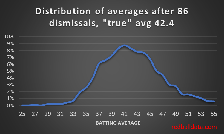
Figure 3 tells us it’s almost certain Ramprakash wasn’t the same player in Tests.

But when should he have been dropped? He got a lot of chances. Assume the weakest specialist batsman averages 35. A player should be dropped when they are underperforming the reasonable range of scores that a batsman averaging 35 would produce.

Fig 4 – chance a player was unlucky vs dismissals. Note this is for a player averaging 27 who needs to average 35. The further their performance is from the target average, the faster it becomes clear that it’s not just bad luck.

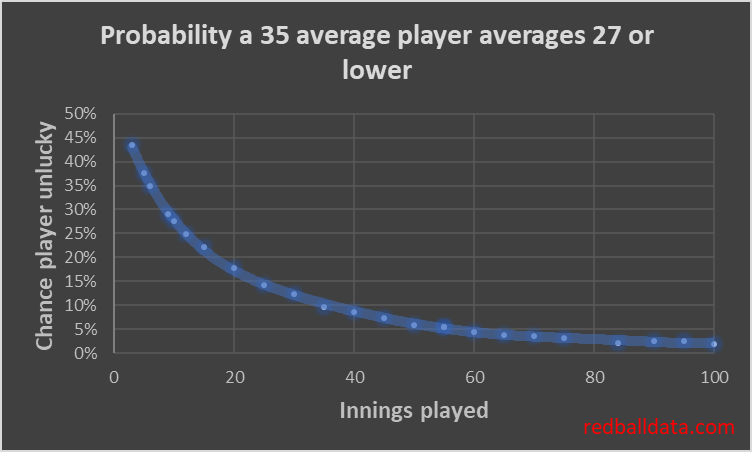
We can see that after 86 dismissals there was a less than 2% chance Ramprakash was capable of averaging 35 in Tests***. Personally, once a player is down to a 15% chance of just having been unlucky, I’d be looking to drop them. That’s 25 innings averaging 27 or under. There’s some evidence that England are already thinking along these lines. Jennings got 31 Test innings, (averaging 25), Denly 26 (30), Compton 27 (29), Malan 26 (28), Hales 21 (27), Vince 22 (25), Stoneman 19 (28). Note that a stronger county or 50 over record should get a player more caps- as it increases the chance that early Test struggles were bad luck (after 30 Test innings Kallis averaged 29, he ended up averaging 55).

I’m intrigued by the possibilities this method presents – I’ll follow up at a later date by looking at promising 2nd XI players who have struggled in County Cricket, and assessing whether they deserve another shot, or they’ve probably had their chips.

2. Adding error bars to averages

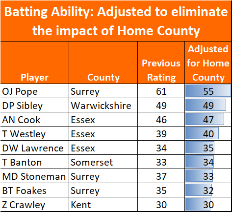
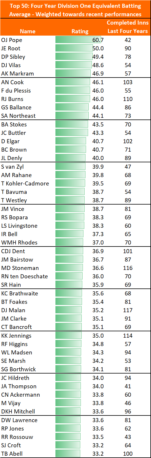
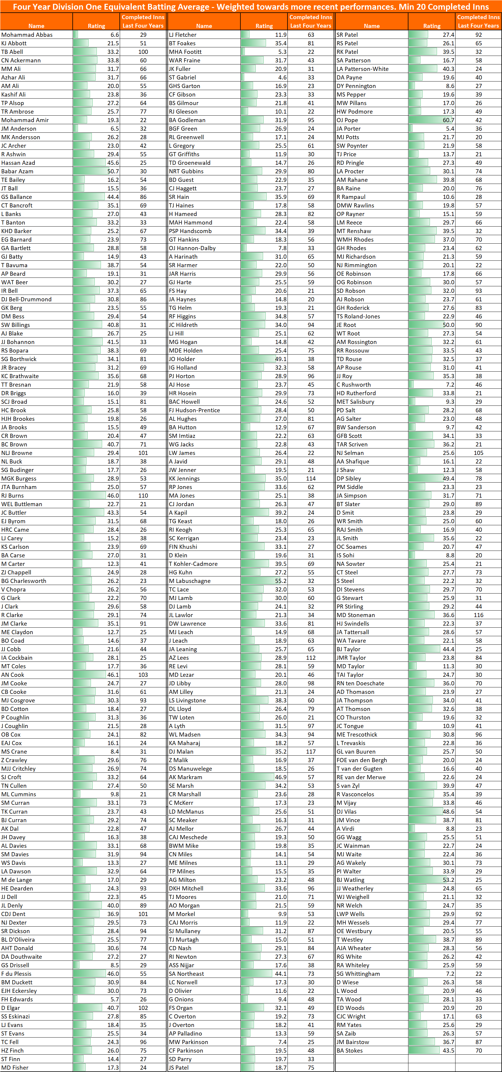
Remember here where I analyzed county players by expected D1 average? I now have the tools to add error bars to those ratings. Back in September I rated Pope above Root. What I wasn’t able to do at that time was reflect the uncertainty in Pope’s ranking because he only had 42 completed innings. Will cover that in a future blog post (with two small children at home, it’s surprisingly difficult to find time for analysis). Spoiler alert – after that many innings, we can say Pope’s expected Division 1 average was 61 (+/-14).

3. Modelling

I can use the uncertainty in Pope’s rating when modelling match performance. Something like for each innings assigning him an expected average based on the distribution of possible averages he might end up with in the long term. That uncertainty will be one of the inputs in my next Test match model (along with Matchups, realistic bowling changes, impact of ball age).

There will be greater uncertainty in a player’s rating when they have just stepped up or down a level.

4. Matchups

We can move from the limited “Jones averages 31 against left handers” to the precise “Jones averages 31 +/- 12 against left handers”, just by taking into account the number of dismissals involved. The cricketing world can banish the cherry pickers and charlatans with this simple change, where stats come with error bars.

***

There’s plenty to chew on here. I’ve not found any similar analysis of cricket before – kindly drop me a line and tell me what you think.

* A bit more detail – my model assumes a geometric distribution of innings-by-innings scoring. With that, one can assign probabilities of all possible outcomes to each ball, then simulate an innings ball-by-ball. To see the spread of outcomes after 100 innings, I ran the simulation 150,000 times, then grouped scores into 1,500 batches of 100 innings. Previous discussion about the limitations of using the first 30 innings as a guide to future performance is here.

** This isn’t perfect. This method estimates the range of observed averages from a given level of ability. In the real world it’s the other way around. That’s a more complicated calculation.

*** Actually slightly better than 2%, because his first class record was so strong (114 hundreds). Ramprakash was an unusual case: there was an argument for him playing far fewer Tests, and an equally good one for him to have been managed better and picked more consistently. I did a twitter poll which was split down the middle on these two choices. Nobody thought stopping slightly earlier would have been the right choice.

On the limitations of averages

Averages are the currency of red ball cricket. We know they get misused (eg. after just a handful of games Ben Foakes averages 41) and when abused they have little predictive power. What I hadn’t realised is just how limited averages are: we almost never have a satisfactory sample size for someone’s average to be the definitive measure of their ability.

Number of innings before you can rely on an average

We can all agree that averages after a couple of innings are of very little value. By “value” I mean predictive power: what does it tell you about what will happen next?

Ben Foakes averaging 42 after five Tests doesn’t mean a lot. But how about Keaton Jennings averaging 25 after 17 Tests?

The below charts show the limitations of averages by comparing them after 10/20/30 Tests (x-axis) with those players’ averages for the rest of their careers (y-axis). The sample is players since 2000 who played more than 70 Tests.

It’s quite striking how dispersed the data is. Not just the 10 Test version (Stuart Broad averaged more than Steve Smith), but even over a longer horizon: Michael Vaughan averaged 53 in his first 30 Tests of this century, then 36 in his last 50 Tests (32% less).

Modelling and True Averages

Sports models are often positively described as “simulating the game 10,000 times”. This isn’t just to make the model sound authoritative, it can take that many simulations to get an answer not influenced by the laws of chance. When I look at an innings in-running, balancing speed against accuracy, I’ll run at least a thousand simulations – any fewer and the sample size will impact results. An example from today – Asad Shafiq’s expected first innings average was 55, yet a 1,000 iteration run of the model gave his average as 54.3. Close, but not perfect.

Shouldn’t it be the same with averages? If we don’t have a thousand innings, lady luck will have played a part. We never have a thousand innings.

Looking at modelled data, I find that after 35 innings (c. 20 Tests), there is still a one-in-five chance that someone’s average differs by more than 20% from what they would average in the long term. A batsman that would average 40 in the long run could, through bad luck, average 32 after 20 Tests.

Fig 2 – Theoretical evolution of average and how it converges with true average (based on Red Ball Data model).

Sir Donald Bradman had a 99.94 average at the end of his career (70 completed innings). There’s a c.40% chance his average would have been +/- 10% if he had played enough innings for his average to have been a true reflection of his ability. We don’t know how good Bradman was*.

Implications

  • Don’t blindly slice & dice averages – they’ll tell you a story that isn’t true. Yes, if you have a mechanism to test (eg. Ross Taylor before and after eye surgery), there might be a real story. But just picking a random cutoff will mean you misread noise as signal (Virat Kohli averaged 44 up to Sept 2016, but 70 since then).
  • Use age adjusted career averages as a best view of future performance.
  • First Class data has to be a factor in judging Test batsmen, even when they have played 30 Tests. Kane Williamson averaged just 30 in his first 20 Tests. Credit to the New Zealand selectors for persevering.
  • There has to be a better metric than batting average. Times dismissed vs Expected Wickets times (Strike Rate / Mean Strike Rate) is one that I’d expect to become commonplace in future. Another might be control % in the nets. Yes, I went there: I believe there is some merit in the “he’s hitting it nicely in the nets” line of reasoning.

This analysis can be repeated for 20-20 – I’ll cover that in my next post.

Further reading

Owen Benton already covered the modelled side of averages here. His found an 80% chance that a batsman’s average is within 20% of their true average after 50 innings, which is in line with my modelling. His approach is rather practical: what’s the chance an inferior batsman has the better average after x innings?

*Factor in Bradman’s 295 completed First Class innings at an average of 95 and we can get precision on how good he was. But that sentence would lack punch, and this blog’s barely readable at the best of times.

County grounds ranked by ease of batting

In this piece I’ll look at which grounds are best for red ball batting, and use that to see what impact that has on averages: how much of a boost do Surrey’s batsmen get from playing at the Oval?

Fig 1 – County grounds ranked according to runs per wicket in County Championship matches over the period 2017-19. Grounds where fewer than 100 wickets fell in that time are excluded.

So what?

Beyond it being a spot of trivia, I can immediately see two reasons why this matters.

i. High scoring grounds harm the county’s league position

In County Cricket there are 16 points for a win, 5 for a draw and none for losing. A win and a loss is worth 16 points, while two draws is worth 10. Drawing is bad*.

Fig 2 – Runs per Wicket in the County Championship over 2017-19 plotted against the Draw percentage for that ground. Higher runs per wicket are associated with more draws.

And yet there are teams producing high scoring pitches, boosting the chances of a draw, and reducing their chances of picking up 16 points.

Compare Gloucestershire’s two home grounds since 2017: at Bristol (32 Runs per Wicket), W2 L4 D8. Cheltenham (28 Runs per Wicket), W4 L1 D2. Excluding bonus points, Cheltenham is worth an extra 5.4 points per match. While that’s an extreme example, and the festival only takes place in the summer months, there’s still the question “why make Bristol so good for batting”?

Maybe a deeper look at the data will reveal why Gloucestershire and Surrey don’t try to inject a bit more venom into Bristol and The Oval; for now it looks like an error.

*There’s an exception: a team that is targeting survival in Division 1 might choose to prepare a flat track and harvest batting points plus drawn match points in certain situations. For the other 15 counties, drawing is still bad.

ii. Averages should be adjusted to reflect where people play their Cricket.

When using data to rank county batsmen and bowlers, the one gap that I couldn’t quantify was the impact of how batting or bowling friendly each player’s home county is. With this data we can add an extra level of precision to each player’s ratings.

How would we do that? It would be wrong to simply take the difficulty of a player’s home ground as the adjustment – because there are also away games. The logical approach would be to take the average of that player’s home grounds (50%, weighted by the various home grounds that county uses) and the other teams in that division (50% weighting).

Fig 3 – Impact on batting average from the relative batting friendliness of that county’s grounds (2017-19).

For instance, Olly Pope’s average is artificially inflated by 10% from being based at The Oval. That takes his rating (expected Division 1 average) down to 54.6 from the suspiciously strong 60.7.

Fig 4 – Selected players’ expected averages, now we can adjust for each player’s home county

Equally, Tom Abell clambers up the ranks of 2019’s County batsmen: his rating jumps 7.1% to 35.6 from 33.2. Not an extreme move, but a nice boost to go from 50th to 31st on the list.

This takes us one step closer to a ratings system that captures everything quantifiable. Before next season I’ll adjust the ratings of batsmen and bowlers to reflect this factor.

Further reading

A summary from 2004 of the county grounds and how they play http://www.bookmakers1.com/englishcricketgrounds.html

Remarkable how many of the descriptions feel alien now – you wouldn’t believe that Taunton was “an absolutely stonking batting track”.

Batting: All County Cricketers Rated

This page contains expected County Championship Division One batting averages for all County Cricketers to have i) played during 2019; and ii) batted in at least 20 completed innings since 2016.

Performances in the Second Eleven Championship, County Championship and Test Cricket are included, though each performance is weighted according to the level being played at (so averaging 30 in Test Cricket is much better than averaging 40 in the Second Eleven Championship).

To give a better indication of current ability, and to partly adjust for age, ratings are weighted more heavily towards recent performances.

Ratings are shown if each player were playing in Division One – this ensures bowlers are compared on an apples-to-apples basis.

This version includes matches up to 29th September 2019. For an update, see the 2021 County Championship preview, which contains much more information about each player.

Top batsmen

Fig 1 – Top 50 Batsman in 2019 County Cricket. Min 40 completed innings since 2016.

Full list

Fig 2 – All Batsmen in 2019 County Cricket. Min 20 completed innings since 2016.

Key findings

Zak Crawley is an odd Test selection

  • Expected Division 1 average under 30
  • Only averaged 34 in 2019, after averaging 32 in Division 2 in 2018.
  • Even separately adjusting for age (he’s only 21), it’s hard to argue he’s currently better than Dent & Rhodes.

Ollie Pope is practically too good to be true

  • Expect his average to come down – he can’t possibly have an expected average exceeding 60.
  • Only 42 completed innings – barely a sufficient sample size to be included in the top 50 players.
  • Still, he’s easily worth a Test place.

Very few English batsmen are capable of consistently averaging over 40 in Division 1

  • Cook, Ballance, Northeast and Brown are the four England qualified batsmen who would be more likely than not to average over 40.

There’s more decent English openers than you may have been told elsewhere

Keaton Jennings, Mark Stoneman, Chris Dent and Will Rhodes could cover Burns and Sibley. And, if he could be coaxed out of Chelmesford, Cook.

England selectors might well be relieved that Cook has retired – imagine having to choose two out of Cook, Sibley and Burns to open the batting.

What do you think?

No doubt there’s plenty of themes and trends from the data that I’ve not mentioned – please do drop me a line through the contact page or @edmundbayliss on Twitter and let me know what you think.

On the decline of Test Batting being driven by T20

This is a pretty basic three-card-trick, in which I’ll make the case that T20 batting has harmed Test averages.

In summary, batting techniques began to adapt earlier this decade so a T20 strike rate of 130 was low risk, then ODI batting adopted those techniques, and finally Test players became unable to adjust between three formats. It’s just one possibility, and I’m aware that correlation is not the same as causation. Don’t worry, there’s charts behind the opinions!

1.Evolution of T20 batting 2011 – 2018

Firstly, high-risk fast-scoring T20 batting has become lower risk. Wisden reckons it’s because teams are getting better value out of the same number of attacking shots (ie. cleaner hitting, not just playing across the line – see Kumar Sangakkara’s description in this video). A precis: “It’s never just wild swings”.

Fig 1 – Runs per wicket and Strike Rate by year in T20 International Cricket. Note how the Strike Rate in 2005 was 127, but batsmen needed to take risks to do it: averaging just 18 runs per Wicket. By 2018 that average was over a third higher.

2.ODI batting follows the trend 2015 – 2018

ODI Cricket batting then became more like T20. There’s good reason for this – the optimum strategy for maximizing runs in ODIs became to select T20 players and ask them to score a little more slowly, rather than pick Test players and ask them to score 50% faster.

Fig 2 – Runs per wicket and Strike Rate by year in ODI Cricket (Test teams only). The big jump came after 2014.
An aside – there has been focus on how England revolutionised ODI Cricket after their failure at the 2015 World Cup. The above chart shows that that is back-to-front: whatever revolution happened in ODI Cricket happened between 2013 and 2015, then England fixed English one day Cricket.

So far, so good. T20 batting has made ODI’s more interesting. What has it done for Test Cricket?

3.Test Cricket stumbles

Fig 3 – Evolution of Test and ODI averages since 2005.

Sadly, in all the upheaval, Test Cricket has lost its way.

2015 was the tipping point – it became easier to bat in ODIs than Test Cricket. The real slump has been 2018 & 2019- a paltry 27 runs per wicket.

Let’s explore the drivers behind Test batting’s malaise. Firstly, top order batting is the main factor – tail enders are immune:

Fig 4 – Evolution of Test and ODI averages, splitting averages between batsmen 1-7 and 8-11.

Remember the good old days when 38 seemed like a mediocre Test average? That petered out in 2016. Somehow averaging 33 over the last couple of years has been normal. Yuk.

The worst thing? Whatever this disease is, pretty much every team has caught it. Top order Test batting has fallen by the wayside. Test teams are scoring no faster, but averaging less. Hopefully that’s a short term effect caused by the 2019 World Cup. Hopefully.

Fig 5 – Top Seven batsmen, collective average 2005-2017 and 2018-19, plus the difference between the two. Congratulations to NZ for improving and an honourable mention to Bangladesh who have gamely stood their ground. Note that all teams played at least 11 Matches over 2018-19, so with over 100 completed innings for each team we have a decent sample.

Now, I’m not an expert on the technical side of batting – so I won’t try to cover it. A couple of examples though: seeing Jason Roy failing to cope with lateral movement in the World Cup final was alarming. Even more so, watching Bairstow shrink from a world class batsman to one that can’t seem to stop walking past the ball when defending.

Where do we go from here? Some Recommendations to turn the tide:

  • Be willing to separate Test and ODI/T20 batsmen*. Only some will naturally bridge the two squads.
  • Don’t combine ODIs and Tests in the same tour – these are now different disciplines, give players clear windows devoted to the red and white ball games.
  • Selectors at First Class and Test level would see benefit from picking ultra-low strike rate batsmen at the top of the innings. There will be white ball specialists in red ball teams (there aren’t enough red ball players to go round) – thus these players need to be protected from the best bowlers and the new ball. For example, County Championship winners Essex had Westley (Strike Rate 48) and Cook (SR 45) soaking up the tough conditions.

*I use the word batsmen deliberately: none of this analysis has included the women’s game, therefore there is no evidence to suggest the same conclusions are appropriate.

Appendix

A query comes from @mareeswj on Twitter – “Are test match bowlers getting better or the batters getting worse

To assess how bowling has changed in recent years, one needs to look at the same players’ performances in multiple formats over time. Like in astronomy where having stars of known brightness (“standard candles”) reveals other properties of those stars.

Fortunately, there are 15 bowlers that have taken 15 wickets in ODIs and Tests both up to Dec-2017, and since Jan-2018.

Fig 6 – Comparing All bowlers that have taken:
i) 15+ Wickets in Tests up to 31/12/17
ii) 15+ Wickets in ODIs up to 31/12/17
iii) 15+ Wickets in Tests from 1/1/18 to 28/9/19
iv) 15+ Wickets in ODIs from 1/1/18 to 28/9/19

Pretty consistently, they have recently averaged a lot less in Tests (mean reduction in average of 7.6). It’s a slightly more mixed view on ODIs (mean increase in average of 2.8 runs per wicket).

Trying to keep an open mind, what are the possibilities?

  1. Bowlers have focused on red ball cricket
  2. Batsmen have focused on white ball cricket
  3. Pitches are becoming flatter in white ball cricket and spicier in red ball cricket
  4. Ball / umpiring / playing condition changes.

Personally, only #2 feels plausible to me, with the others being secondary effects.

The ODIs they are a’changing

My ODI model was built in those bygone 260-for-six-from-50-overs days. Having dusted it off in preparation for the Cricket World Cup it failed its audition: England hosted Pakistan recently, passing 340 in all four innings. Every time, the model stubbornly refused to believe they could get there. Time to revisit the data.

Dear reader, the fact that you are on redballdata.com means you know your Cricket. Increased Strike Rates in ODIs are not news to you. This might be news to you though – higher averages cause higher strike rates.

Fig 1: ODI Average and Strike Rate by Year. Top 9 teams only. Note the strength of correlation.

Why should increasing averages speed up run scoring? Batsmen play themselves in, then accelerate*. The higher your batsmen’s averages, the greater proportion of your team’s innings is spent scoring at 8 an over.

Let’s explore that: Assume** everyone scores 15 from 20 to play themselves in, then scores at 8 per over. Scoring 30 requires 32 balls. Scoring 50 needs 46 balls, while hundreds are hit in 84 balls. The highest Strike Rates should belong to batsmen with high averages.

Here’s a graph to demonstrate that – it’s the top nine teams in the last ten years, giving 90 data points of runs per wicket vs Strike Rate

Fig 2: Runs per over and runs per wicket for the first five wickets for the top nine teams this decade, each data point is one team for one year. Min 25 innings.

Returning to the model, what was it doing wrong? It believed batsmen played the situation, and that 50-2 with two new batsmen was the same as 50-2 with two players set on 25*. Cricket just isn’t played that way. Having upgraded the model to reflect batsmen playing themselves in, now does it believe England could score 373-3 and no-one bat an eyelid? Yes. ODI model 3.0 is dead. Long live ODI model 4.2!

Fig 3: redballdata.com does white ball Cricket. Initially badly, then a bit better.

Still some slightly funny behaviour, such as giving England a 96% chance of scoring 200 off 128 or a 71% chance of scoring 39 off 15. Having said that, this is at a high scoring ground with an excellent top order. Will keep an eye on it.

In Summary, we’ve looked at how higher averages and Strike Rates are correlated, suggested that the mechanism for that is that over a longer innings more time is spent scoring freely, and run that through a model which is now producing not-crazy results, just in time for the World Cup.

*Mostly. Batsmen stop playing themselves in once you are in the last 10 overs. Which means one could look at the impact playing yourself in has on average and Strike Rate. But it’s late, and you’ve got to be up early in the morning, so we’ll leave that story for another day.

**Bit naughty this. I have the data on how batsmen construct their innings, but will be using it for gambling purposes, so don’t want to give it away for free here. Sorry.