The ODI “who is winning?” formula

Modelling a chase is hard. I was looking for a rule of thumb: a quick calculation that could support the monte-carlo simulation I run. And here it is:

Decimal odds of chasing team winning = 1 + (Required Runs/Expected Runs)^8

Jonas (@cric_analytics)

Jonas gave the example of Australia needing 145 more to win an ODI against England. He thought Australia could on average expect to score 110 from their last 20 overs. Australia’s decimal odds were thus 1+(145/110)^8 = 10.1 (or roughly a 10% chance of winning).

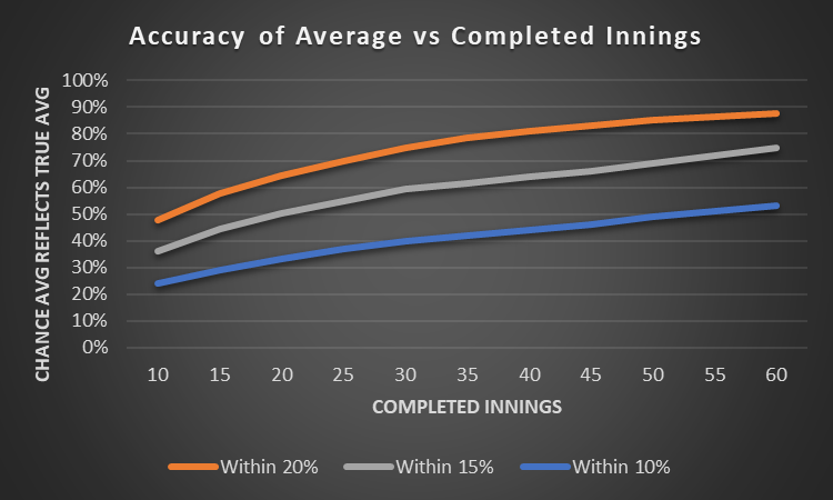
To successfully unpack (or steal!) the formula, the element that needs a bit of thought is “Expected Runs”. We can use Duckworth-Lewis, combined with ground data to give an approximation. 20 overs & 5 wickets left meant 38.6% of resources remaining. On a 285 par pitch, that’s the 110 Expected Runs that Jonas calculated.

Taking the formula one step further, “Expected Runs” can be adjusted for the quality of the batting and bowling teams to give a more precise calculation for a specific run chase. I have added this expanded formula to my model to better understand who is winning and why.

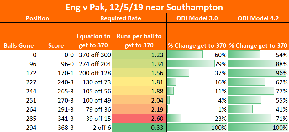
Here’s an example of what this looked like when Australia were 222-5, needing another 81 from the last 10 overs (third ODI, 16th Sept 2020):

Aus 222-5 (40). Maxwell 74* Carey 77*. Target 303.

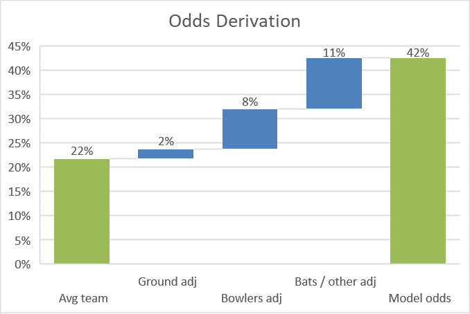
The raw formula gave Australia a 22% chance with 26.1% of resources remaining (Expected Runs = 69, on the basis that a normal par score is 264 – that may be an underestimate as scores keep rising). However Old Trafford slightly favours the batsmen, and England’s attack is sub par – lifting Australia to 32%.

My model had Australia at a 42% chance – the extra 10% coming from the strength of Australian batting, the two batsmen being set, and any other differences between my model’s Monte Carlo simulation and Jonas’ formula. The right hand column is the output of my model, and the penultimate column is the one that goes haywire if something is wrong: a useful check.

What’s the message? Firstly, if the model is working, I can see who is winning during a chase and why. Secondly, matchups and other complexity have made my model something of a “black box” – Jonas’ formula will be a useful check that my model isn’t off piste.

What if the 2005 Ashes had been a draft?

What would happen if the 2005 Ashes series started with a draft? I ran this scenario as a way to test my upgraded Test match model. By enlisting outsiders to draft the teams, they were then eagle-eyed in reviewing the results (thanks to Rob and Pud for their contribution).

Brilliantly, the series was decided in the last hour at the Oval, with Michael Vaughan shepherding the tail against the new ball.

Model updates

Since the last iteration I’ve added matchups, refreshed ground data, added realistic spin/seam performance by innings, and had another go at lifelike bowling changes.

With this much improvement comes lots of testing, and this exercise is just one small part of that.

Rating Players

Instead of career averages, I used performances up to July 2005 to rate the players. This is how I would have rated players at the time – serving as an additional check of my ratings process.

It throws up a few oddities: Having averaged 54 over the last four years’ County Championship, Rob Key looked Kevin Pietersen’s equal.

The Draft

Squad analysis

Rob foolishly excluded Martyn and Thorpe, but we’ll let him off because England dropped Thorpe in the real world.

Gilchrist is so much better than Geriant Jones that it was a surprise Gilchrist was eighth pick: there was huge value in securing his services early.

Clever from Rob to grab Flintoff and Warne. Once he had done that, there was a premium on Collingwood as the last all rounder: he should have been earlier than 18th pick.

The Series

Rob negotiated a tricky chase of 190 at Lord’s before comfortable back-to-back wins for Pud at Trent Bridge and Edgbaston. McGrath’s match figures of 6-74 at Edgbaston exposed Rob’s tail.

Hubris set in for Pud at Headingley – winning the toss and batting, nobody made it to 30. Then all four bowlers conceded centuries as Rob amassed 504 (Strauss 235*) to set up a comfortable win.

All square two-all going to the Oval. A characteristically flat pitch, yet the pressure almost got to Rob at the toss. With Warne struggling, Rob considered fielding first before his better judgement kicked in.

Three scores in excess of 400 put the game out of Pud’s reach, leaving him 102 overs to survive to share the Ashes. Wickets fell steadily. Collingwood (23) was fifth man out just after lunch, leaving Vaughan (102*) and Gilchrist much to do.

Bizarrely, Gilchrist (52 from 68) counter-attacked. Pud’s views when Warne bagged the wicket are unbroadcastable. With ten overs to go, Vaughan and Harmison were standing firm, but two wickets in two balls for Hoggard won the match and the series, for Rob.

Batting Averages

Andrew Strauss was “Man of the Series” for his 557 runs at an average of 80.

Bowling Averages

Warne’s performance was unlucky. His average of 46 was unexpected. Subsequent testing confirmed that he should have thrived against Pud’s numerous right handers, but it didn’t happen for him.

Model upgrades required

– Bring back best bowlers when a team is seven or eight down. Collingwood shouldn’t have bowled at the tail as much as he did – this is why Collingwood bagged 19 wickets at 23.

– Build in the ability to play for the draw. Gilchrist’s five-an-over antics were unlikely on the fifth day with 300 required to win.

Conclusion

A decent hour’s entertainment and two improvements for the model. A success.

On the limitations of averages

Averages are the currency of red ball cricket. We know they get misused (eg. after just a handful of games Ben Foakes averages 41) and when abused they have little predictive power. What I hadn’t realised is just how limited averages are: we almost never have a satisfactory sample size for someone’s average to be the definitive measure of their ability.

Number of innings before you can rely on an average

We can all agree that averages after a couple of innings are of very little value. By “value” I mean predictive power: what does it tell you about what will happen next?

Ben Foakes averaging 42 after five Tests doesn’t mean a lot. But how about Keaton Jennings averaging 25 after 17 Tests?

The below charts show the limitations of averages by comparing them after 10/20/30 Tests (x-axis) with those players’ averages for the rest of their careers (y-axis). The sample is players since 2000 who played more than 70 Tests.

It’s quite striking how dispersed the data is. Not just the 10 Test version (Stuart Broad averaged more than Steve Smith), but even over a longer horizon: Michael Vaughan averaged 53 in his first 30 Tests of this century, then 36 in his last 50 Tests (32% less).

Modelling and True Averages

Sports models are often positively described as “simulating the game 10,000 times”. This isn’t just to make the model sound authoritative, it can take that many simulations to get an answer not influenced by the laws of chance. When I look at an innings in-running, balancing speed against accuracy, I’ll run at least a thousand simulations – any fewer and the sample size will impact results. An example from today – Asad Shafiq’s expected first innings average was 55, yet a 1,000 iteration run of the model gave his average as 54.3. Close, but not perfect.

Shouldn’t it be the same with averages? If we don’t have a thousand innings, lady luck will have played a part. We never have a thousand innings.

Looking at modelled data, I find that after 35 innings (c. 20 Tests), there is still a one-in-five chance that someone’s average differs by more than 20% from what they would average in the long term. A batsman that would average 40 in the long run could, through bad luck, average 32 after 20 Tests.

Fig 2 – Theoretical evolution of average and how it converges with true average (based on Red Ball Data model).

Sir Donald Bradman had a 99.94 average at the end of his career (70 completed innings). There’s a c.40% chance his average would have been +/- 10% if he had played enough innings for his average to have been a true reflection of his ability. We don’t know how good Bradman was*.

Implications

  • Don’t blindly slice & dice averages – they’ll tell you a story that isn’t true. Yes, if you have a mechanism to test (eg. Ross Taylor before and after eye surgery), there might be a real story. But just picking a random cutoff will mean you misread noise as signal (Virat Kohli averaged 44 up to Sept 2016, but 70 since then).
  • Use age adjusted career averages as a best view of future performance.
  • First Class data has to be a factor in judging Test batsmen, even when they have played 30 Tests. Kane Williamson averaged just 30 in his first 20 Tests. Credit to the New Zealand selectors for persevering.
  • There has to be a better metric than batting average. Times dismissed vs Expected Wickets times (Strike Rate / Mean Strike Rate) is one that I’d expect to become commonplace in future. Another might be control % in the nets. Yes, I went there: I believe there is some merit in the “he’s hitting it nicely in the nets” line of reasoning.

This analysis can be repeated for 20-20 – I’ll cover that in my next post.

Further reading

Owen Benton already covered the modelled side of averages here. His found an 80% chance that a batsman’s average is within 20% of their true average after 50 innings, which is in line with my modelling. His approach is rather practical: what’s the chance an inferior batsman has the better average after x innings?

*Factor in Bradman’s 295 completed First Class innings at an average of 95 and we can get precision on how good he was. But that sentence would lack punch, and this blog’s barely readable at the best of times.

The ODIs they are a’changing

My ODI model was built in those bygone 260-for-six-from-50-overs days. Having dusted it off in preparation for the Cricket World Cup it failed its audition: England hosted Pakistan recently, passing 340 in all four innings. Every time, the model stubbornly refused to believe they could get there. Time to revisit the data.

Dear reader, the fact that you are on redballdata.com means you know your Cricket. Increased Strike Rates in ODIs are not news to you. This might be news to you though – higher averages cause higher strike rates.

Fig 1: ODI Average and Strike Rate by Year. Top 9 teams only. Note the strength of correlation.

Why should increasing averages speed up run scoring? Batsmen play themselves in, then accelerate*. The higher your batsmen’s averages, the greater proportion of your team’s innings is spent scoring at 8 an over.

Let’s explore that: Assume** everyone scores 15 from 20 to play themselves in, then scores at 8 per over. Scoring 30 requires 32 balls. Scoring 50 needs 46 balls, while hundreds are hit in 84 balls. The highest Strike Rates should belong to batsmen with high averages.

Here’s a graph to demonstrate that – it’s the top nine teams in the last ten years, giving 90 data points of runs per wicket vs Strike Rate

Fig 2: Runs per over and runs per wicket for the first five wickets for the top nine teams this decade, each data point is one team for one year. Min 25 innings.

Returning to the model, what was it doing wrong? It believed batsmen played the situation, and that 50-2 with two new batsmen was the same as 50-2 with two players set on 25*. Cricket just isn’t played that way. Having upgraded the model to reflect batsmen playing themselves in, now does it believe England could score 373-3 and no-one bat an eyelid? Yes. ODI model 3.0 is dead. Long live ODI model 4.2!

Fig 3: redballdata.com does white ball Cricket. Initially badly, then a bit better.

Still some slightly funny behaviour, such as giving England a 96% chance of scoring 200 off 128 or a 71% chance of scoring 39 off 15. Having said that, this is at a high scoring ground with an excellent top order. Will keep an eye on it.

In Summary, we’ve looked at how higher averages and Strike Rates are correlated, suggested that the mechanism for that is that over a longer innings more time is spent scoring freely, and run that through a model which is now producing not-crazy results, just in time for the World Cup.

*Mostly. Batsmen stop playing themselves in once you are in the last 10 overs. Which means one could look at the impact playing yourself in has on average and Strike Rate. But it’s late, and you’ve got to be up early in the morning, so we’ll leave that story for another day.

**Bit naughty this. I have the data on how batsmen construct their innings, but will be using it for gambling purposes, so don’t want to give it away for free here. Sorry.