
In this piece I’ll look at which grounds are best for red ball batting, and use that to see what impact that has on averages: how much of a boost do Surrey’s batsmen get from playing at the Oval?
So what?
Beyond it being a spot of trivia, I can immediately see two reasons why this matters.
i. High scoring grounds harm the county’s league position
In County Cricket there are 16 points for a win, 5 for a draw and none for losing. A win and a loss is worth 16 points, while two draws is worth 10. Drawing is bad*.
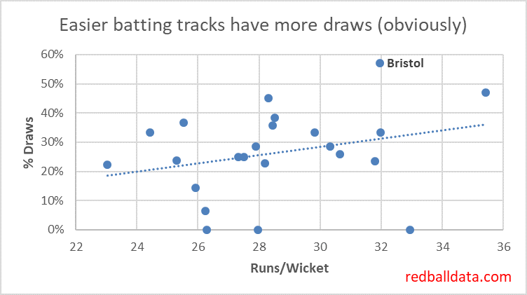
And yet there are teams producing high scoring pitches, boosting the chances of a draw, and reducing their chances of picking up 16 points.
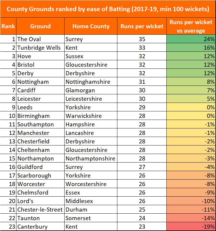
Compare Gloucestershire’s two home grounds since 2017: at Bristol (32 Runs per Wicket), W2 L4 D8. Cheltenham (28 Runs per Wicket), W4 L1 D2. Excluding bonus points, Cheltenham is worth an extra 5.4 points per match. While that’s an extreme example, and the festival only takes place in the summer months, there’s still the question “why make Bristol so good for batting”?
Maybe a deeper look at the data will reveal why Gloucestershire and Surrey don’t try to inject a bit more venom into Bristol and The Oval; for now it looks like an error.
*There’s an exception: a team that is targeting survival in Division 1 might choose to prepare a flat track and harvest batting points plus drawn match points in certain situations. For the other 15 counties, drawing is still bad.
ii. Averages should be adjusted to reflect where people play their Cricket.
When using data to rank county batsmen and bowlers, the one gap that I couldn’t quantify was the impact of how batting or bowling friendly each player’s home county is. With this data we can add an extra level of precision to each player’s ratings.
How would we do that? It would be wrong to simply take the difficulty of a player’s home ground as the adjustment – because there are also away games. The logical approach would be to take the average of that player’s home grounds (50%, weighted by the various home grounds that county uses) and the other teams in that division (50% weighting).
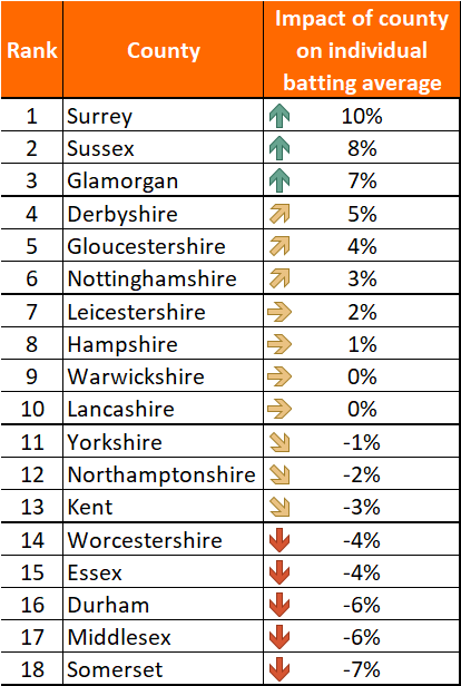
For instance, Olly Pope’s average is artificially inflated by 10% from being based at The Oval. That takes his rating (expected Division 1 average) down to 54.6 from the suspiciously strong 60.7.
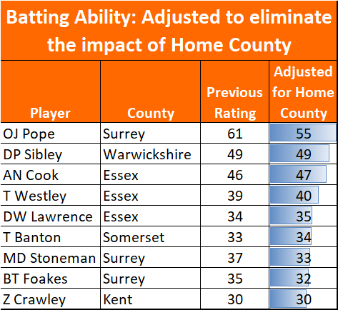
Equally, Tom Abell clambers up the ranks of 2019’s County batsmen: his rating jumps 7.1% to 35.6 from 33.2. Not an extreme move, but a nice boost to go from 50th to 31st on the list.
This takes us one step closer to a ratings system that captures everything quantifiable. Before next season I’ll adjust the ratings of batsmen and bowlers to reflect this factor.
Further reading
A summary from 2004 of the county grounds and how they play http://www.bookmakers1.com/englishcricketgrounds.html
Remarkable how many of the descriptions feel alien now – you wouldn’t believe that Taunton was “an absolutely stonking batting track”.
