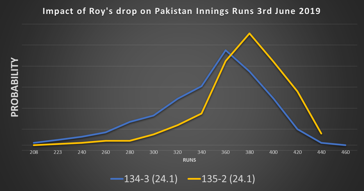
Jason Roy dropped the ball today. I didn’t see it, but apparently it was rather an easy catch. Pakistan went on from 135-2 (24 overs) to finish 348-8, a score just out of England’s reach. The final winning margin was 14 runs.
What did that drop do to Pakistan’s expected score? Here’s the simulations for the two scenarios: 136-2 (24.1) and 135-3 (24.1)
Fig 1: Two scenarios for the 145th ball of Pakistan’s Innings: Out or one run scored.
If Hafeez had been out, the mean score was 350, while the dropped catch increased the mean score to 377. That’s a 27 run impact.
Can we break that down?
Firstly, the runs scored on that ball. Value = one run. Easy.
Secondly, the reduced run rate as a new batsman plays themselves in. According to some analysis I’ve done on how batsmen play themselves in, that’s worth four runs (Hafeez had faced 12 balls by this point, so would have been just starting to accelerate).
The rest of the impact (22 runs) comes from two factors: more conservative batting as Pakistan from having fewer wickets in hand, and the increased chance of getting bowled out (and thus not using all their overs).
To generalise, the cost of a dropped catch would be a function of:
Runs scored on that ball
Whether the surviving batsman is set
How long left in the innings (the wicket affects the value of future deliveries. Thus the later in the innings a wicket falls, the lower the value of that wicket)
How many wickets the batting team has in hand (does the wicket cause more defensive batting)? In this case, being three wickets down after half the innings still leaves plenty of scope for aggressive batting so doesn’t have as big an impact as it could.
Strike Rate and Average of the reprieved batsman relative to the rest of the team (dropping Wahab Riaz is better than dropping Babar Azam).
Interesting topic. I might come back to this when other people drop sitters.
Had a brief look at the Cricket World Cup fixtures, didn’t see anything of interest – with 40 odd days to play nine matches each, there would be plenty of time between games so no need to take fatigue into account.
Actually, the fixture list has some unnecessary oddities. There are two occasions when a team plays twice in three days.
Afghanistan follow their match against India on 22nd June with one against Bangladesh on the 24th.
Then India have their own congestion when their 30th June game against England is followed by – you’ve guessed it- Bangladesh on the 2nd July.
Individual performances in the Royal London One Day Cup shows that when bowlers have had less rest than the batsmen they are bowling to, the batsmen get an boost. This was particularly clear cut when teams played twice in three days.
Bangladesh may have a better chance of making the semi finals than the 18% implied by the bookies.
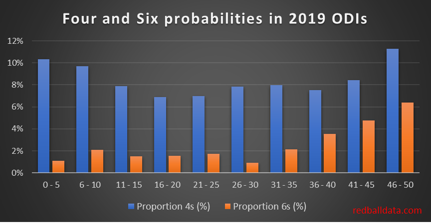
Using a ball-by-ball database of 2019 ODIs, I’ve looked at boundary hitting through the innings. This was to refresh my ODI model, which was based on how people batted in 2011.
Fig 1: Boundary hitting by over. ODIs between the top nine teams, Q1 2019
Key findings:
First 10 over powerplay: 10% of balls hit for four, c.2% sixes. Just two fielders outside the ring.
Middle overs 10 – 40: c. 8% balls hit for four, c. 2% sixes. Four fielders outside the ring limits boundary options. Keeping wickets in hand mean batsmen don’t risk hitting over the top, though if wickets in hand the six hitting rate starts to pick up from the 30th over.
Overs 40-45: Six hitting reaches 5%. No increase in the number of fours: five boundary riders give bowlers plenty of cover.
Overs 46-50: Boundary rate c.18% with boundaries of both types picking up.
These probabilities have been added to the model, which now makes some sense and isn’t claiming a 6% chance England score 500!
An early view of what the model thinks for Thursday’s Cricket World Cup opener – if England bat first 342 is par. 69% chance England get to 300, 20% chance of England getting to 400. I can believe that, it is The Oval after all.
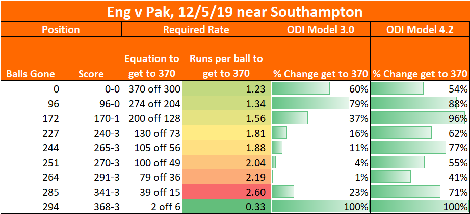
My ODI model was built in those bygone 260-for-six-from-50-overs days. Having dusted it off in preparation for the Cricket World Cup it failed its audition: England hosted Pakistan recently, passing 340 in all four innings. Every time, the model stubbornly refused to believe they could get there. Time to revisit the data.
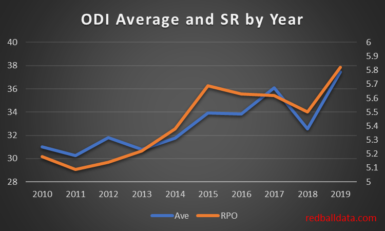
Dear reader, the fact that you are on redballdata.com means you know your Cricket. Increased Strike Rates in ODIs are not news to you. This might be news to you though – higher averages cause higher strike rates.
Fig 1: ODI Average and Strike Rate by Year. Top 9 teams only. Note the strength of correlation.
Why should increasing averages speed up run scoring? Batsmen play themselves in, then accelerate*. The higher your batsmen’s averages, the greater proportion of your team’s innings is spent scoring at 8 an over.
Let’s explore that: Assume** everyone scores 15 from 20 to play themselves in, then scores at 8 per over. Scoring 30 requires 32 balls. Scoring 50 needs 46 balls, while hundreds are hit in 84 balls. The highest Strike Rates should belong to batsmen with high averages.
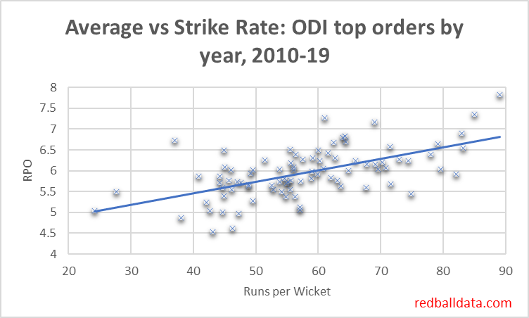
Here’s a graph to demonstrate that – it’s the top nine teams in the last ten years, giving 90 data points of runs per wicket vs Strike Rate
Fig 2: Runs per over and runs per wicket for the first five wickets for the top nine teams this decade, each data point is one team for one year. Min 25 innings.
Returning to the model, what was it doing wrong? It believed batsmen played the situation, and that 50-2 with two new batsmen was the same as 50-2 with two players set on 25*. Cricket just isn’t played that way. Having upgraded the model to reflect batsmen playing themselves in, now does it believe England could score 373-3 and no-one bat an eyelid? Yes. ODI model 3.0 is dead. Long live ODI model 4.2!
Fig 3: redballdata.com does white ball Cricket. Initially badly, then a bit better.
Still some slightly funny behaviour, such as giving England a 96% chance of scoring 200 off 128 or a 71% chance of scoring 39 off 15. Having said that, this is at a high scoring ground with an excellent top order. Will keep an eye on it.
In Summary, we’ve looked at how higher averages and Strike Rates are correlated, suggested that the mechanism for that is that over a longer innings more time is spent scoring freely, and run that through a model which is now producing not-crazy results, just in time for the World Cup.
*Mostly. Batsmen stop playing themselves in once you are in the last 10 overs. Which means one could look at the impact playing yourself in has on average and Strike Rate. But it’s late, and you’ve got to be up early in the morning, so we’ll leave that story for another day.
**Bit naughty this. I have the data on how batsmen construct their innings, but will be using it for gambling purposes, so don’t want to give it away for free here. Sorry.
At first glance Notts look unstoppable: W6 L1 NR1, NRR +0.6. Two days of rest and home advantage.
Their batting is excellent: Hales and Duckett over their careers averaging high 30s at a run a ball mean more often than not a solid platform with runs on the board and wickets in hand for Mullaney, Moores, Fletcher to work with at the end of the innings. During the group stages scored over 400 twice in seven innings (Somerset’s highest is 358).
However – Somerset’s strength is their bowling – specifically taking wickets.
This makes for a rather unusual range of first innings scores if Notts bat first. Remember that Trent Bridge is a high scoring ground.
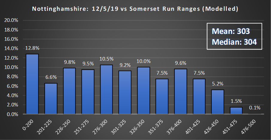
Fig 1: Notts projected runs.
Notts are just as likely to score 201-225 as they are 426-450! Such an even distribution is very rare. Nottinghamshire have a roughly 1500-1 chance of breaking the List A world record of 496.
Compare that to the more steady Somerset. Ali, Hildreth, Abell are dependable but not explosive batsmen. Batting deep means they can dig themselves out of trouble and find their way to a total. Thus Somerset have a 66% chance of scoring in the range 276-375.
Fig 2: Somerset projected runs
These are two evenly matched teams.
If you want an even contest that bubbles up over time, hope that Somerset bat first – they will get a reasonable score. Personally, I’d like to see Notts bat first because *cliche* anything could happen. Yes, I appreciate that means a good chance of a low score that Somerset fly past, or a high score that the visitors will get nowhere near.
If imitation is the sincerest form of flattery, I have something of a crush on International Cricket Captain. Much of the modelling I’ve done is an attempt to recreate what that game could do in simulating whole matches in the blink of an eye. Here is a link to the International Cricket Captain website, if you think you might have 300 hours to kill this summer.
There are two parts of the International Cricket Captain engine I’ve not incorporated: Form and Fatigue. I don’t believe in form and won’t incorporate it until it shows up in the numbers (if the facts change, I’ll change my mind). Let’s look at fatigue instead…
Background
Fixture congestion is nothing new – who can forget 1066, when Harold II’s middle order collapsed at Sussex just 19 days after an attritional fixture on a Yorkshire out-ground.
The Royal London One Day Cup (RLODC) has a punishing schedule – most matches are played less than 48 hours after the last one finished. Some teams get longer breaks- which means we have tired players against slightly less tired ones. This gives us some tasty data to measure the impact of fatigue.
Before we get into the numbers, I’d like to define the tiredness in question – it’s mid-week weariness. Not the short term fatigue that means that as a bowler goes through a spell their effectiveness drops, nor the possibility of long term decline over a season from a relentless schedule. This tiredness is like the mid-music-festival malaise one might experience on the Saturday of Glastonbury, when the preceding days take their toll.
To define a “fatigue factor” we need to see how players fare when one team has had more rest than the other.
Findings
Factors affecting RLODC Team Performance
Home Advantage: Home team gains 0.13 runs per over. Away team loses 0.13 runs per over. Net effect on a match 13 runs. I wasn’t specifically looking for this, but had to analyse it as a factor that needed to be controlled for before conclude on Fatigue.
Fatigue: Batting team better rested gains 0.23 runs per over. More rested Bowlers concede 0.23 fewer runs per over. Maximum impact on a match 23 runs.
Implications i. 2019 RLODC
Fatigue has an interesting effect on the semi finals: the winners of the North and South groups host the winners of quarter finals between the teams which finished second and third in the groups. The quarter finals take place on the 10th May 2019, the semi finals on the 12th May 2019.
Nottinghamshire and Hampshire have been the best teams in the group stage, and will have both home advantage and the benefit of >6 days rest, rather than the two days of rest the quarter finalists have.
I will running these extra inputs through my 50 over model this weekend to see if this insight offers any gambling opportunities. My expectation is that I’m late to the party on this, and the odds will already factor in rest periods and home advantage.
Implications ii. Selection
In a tournament like the RLODC, we should see more rotation of bowlers in and out of the team, particularly if a squad has bowling depth. Sussex only used eight bowlers in as many matches: who knows whether giving Hamza a day off might have been the difference that got them into the quarter finals, instead of mid-table disappointment. Just imagine if Sussex had had Chris Jordan available to them for the second half of the group stages, rather than on England duty.
Further Reading
Green All Over – Betting Blog, see link for a post on the impact of rest on Baseball odds (which reminded me that there was a potential input I was ignoring).
Tours are strange beasts. Anyone who has ever been on a Club Rugby tour can attest that pre-match preparation isn’t entirely conducive to peak performance.
Professional sport should be the opposite of this. Next time you are watching Cricket on TV and they cut to the pavilion balcony, count how many non-playing staff are on hand. I’m not criticising touring parties for being too large – I’ve no data to assess that on. My point is that lots of money is spent by governing bodies to ensure enough specialists are on hand to keep eleven cricketers playing at their best.
Here’s a theory – all this investment in the extra 1% is missing the wood for the trees. The tour scheduling is an unseen problem.
Recall the post-before-last regarding Home Advantage growing as a series goes on, and your correspondent having an effect with no obvious cause? Going through the archives of @Chrisps01’s blog was a possible clue to this – [link] – some analysis on rest periods between matches. A quick re-cut of the data and I could quantitatively look at this effect with two decades’ worth of data.
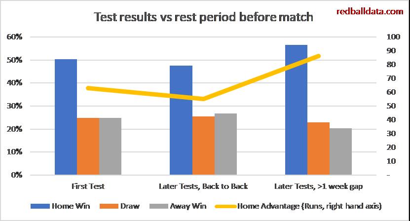
There’s a certain base advantage in the first Test of a series, which is kept at the same level if subsequent Tests are played back-to-back (ie with less than a seven day gap between matches). Away teams are at a much bigger disadvantage when there is a longer gap between Tests.
Think back to summer 2017 – on August 29th West Indies beat England by five wickets to square the series with just the Lord’s Test to come. On September 2nd & 3rd the full strength West Indies team toiled in a meaningless draw against Leicestershire. England rested. West Indies put up little resistance in the third Test, scoring just 300 runs over two innings.
Why might away teams struggle with longer gaps between Tests? Here’s how I rationalise it:
With very short gaps between Tests, both teams are fully focused on recovery and getting the XI back ready to play the next Test. Both teams are therefore doing the same things and so no team gains an advantage over the other.
Longer gaps between Tests mean tour matches for the away team, and (in the modern era) rest for the home team. Even if not all of the team are involved in a tour match, the focus of the touring party is likely to be distracted by a competitive fixture.
Players for the host team may get the opportunity to go home for a few days during a break in the series – the away team will still be living in hotels.
The data implies that the home team’s activities result in better performance in the next Test.
Touring teams should revisit their itinerary so they are best placed to compete throughout a series: plenty of rest, no meaningless mid-series tour matches.
Let’s look at the English First Class matches between Universities (technically the six University Centres of Cricketing Excellence) and Counties. These are vastly mismatched. The 2019 results make depressing reading for fans of university sport: UCCEs played 18 won 0 drawn 11 lost 7. County batsmen averaged 52 runs per wicket, while the students managed a paltry 15. If the UCCEs had been playing in the County Championship, they would have picked up a mere four batting points in over a season’s worth of matches.
It’s quite telling that over the last three years, only three student bowlers came out averaging under 35.
Fig 1- UCCE bowling performances against Counties in First Class Cricket, 2017-19. Overall bowling figures aggregated by player
Let’s not beat about the bush – the Universities were hazed by Counties that weren’t even at full strength. At first glance you might conclude that we can’t learn anything from these matches. Don’t be so defeatist! We have an opportunity to test how much better batsmen become when competing against players from a couple of rungs down the sporting ladder. It has always puzzled me: what should I model when an average player faces great bowling?
The method I’ve used is to compare individual batsmen’s performances in University matches against expected performance in County Championship Division 1. Since there aren’t that many University matches, we’ll need to group players by expected average to get meaningful sample sizes. We will also use three years’ worth of matches.
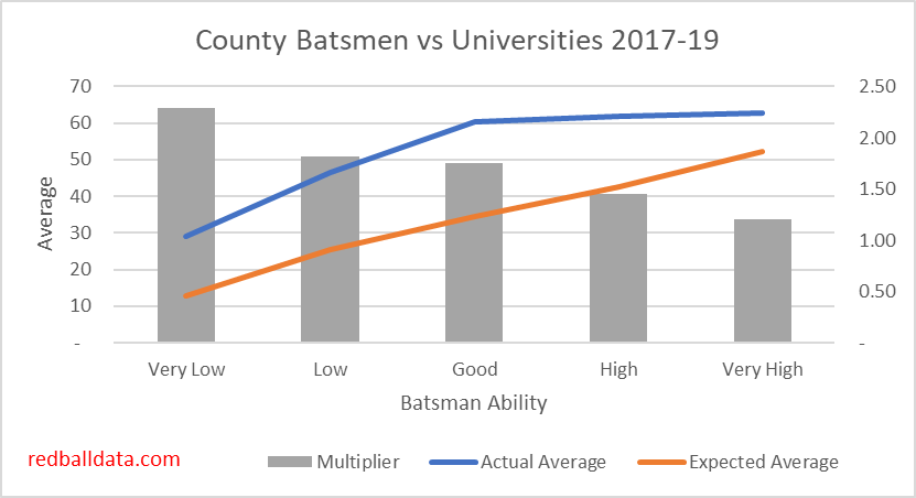
Fig 2. The orange line represents the expected averages for each group of players (eg. “Very Low” are players who average below 20). The blue line shows the average vs Universities for that cohort, while the Grey bar (right hand scale) shows the ratio between actual and expected average.
Some interesting findings:
Overall “multiplier” (ie. boost to batsman’s average from facing University level bowling) 1.73 – a batsman who averages 30 in D1 would average 52 against UCCEs.
The University matches can distort First Class averages, especially for players with limited Caps. For instance, George Hankins averages 25 in FC Cricket, but strip out University matches and that drops to 23. Ateeq Javid’s 25 also drops to 23 when you exclude the 143 against Loughborough. Thus “First Class” average is reliable for county regulars, but fringe players will play a higher proportion of their innings against students. In these cases, “First Class” average should be disregarded in favour of a blended measure of County Championship & Second XI matches.
Batsmen with the lowest averages get the biggest boost– this could be because County Cricket pits them against deliveries which they aren’t good enough to defend. Put them against easier bowling and their technique is up to it, so they flourish.
Both the “Good” batsmen (who average 30-40 in D1) and the “Very Good” batsmen become excellent averaging 60+ against Universities. Why the plateau at 60? This is possibly caused by batsmen that “Retire Out”– which will affect the highest scoring (ie. best) players more. The concept of “Retired Out” is another reason UCCE matches distort FC averages.
Players ranked “Good” or above scored 29 hundreds in 131 completed innings. That’s a Century every 4.5 innings. Quite a mismatch between bat and ball.
It’s hard to appraise fringe County players, because of the low number of matches played. Ideally, scores from the University matches could be incorporated into my database in the same way 2nd XI matches have been (by adjusting for the difficulty of the opposition). However, the above tells us that the standard is too low and variable – so disregarding the data is the safest approach. This means that raw First Class averages are potentially suspect, and county selection should not be based on performances against the Universities – no matter how tempting it is. A fine example of selection being driven by University matches is Eddie Byrom being picked by Somerset on the back of 115* against Cardiff UCCE. He made 6 & 14 against Kent, and hasn’t played since.
Conclusion
Based on the above, there’s no evidence to say that top batsmen become impossible to get out when
they play against weaker bowlers. A reasonable approximation is that
Division 1 batsmen would average 72% more when playing against Universities.
When modelling expected average for a given batsman and bowler, the following rule of thumb is sufficient: Expected average = (batsman average / mean batsman average) * (mean bowler average / bowler average).
PS. Fitting the University Matches into the English summer
What place do the UCCE matches have in the cricketing
calendar? Tradition is important. Personally, I would like these matches to
continue. What’s needed is a window where the best players are unavailable (as
these matches are of limited use to them).
In their wisdom, the ECB have established a 38 day window
called “the Hundred”. I propose a change to the calendar – instead of the
University matches, the 50 over competition should be the curtain raiser for
summer. Half the group games could take place in early April, with the other
half happening at the start of “the Hundred” window. This would be followed by
two weeks of UCCE matches.
This would ease some of the congestion in the fixture calendar, and make a more logical use of county squads and grounds while we wait for “the Hundred” to finish. It would also mean full strength squads playing some 50 over Cricket, so England have some chance of being competitive in future World Cups.
Home advantage exists across many sports, and Cricket is no exception. Each sport has its own factors driving home advantage (1).
It’s a fascinating
theme, and I plan to explore it via a series of posts, building a picture of
Home advantage in Test Cricket.
In this first piece
we’ll start with the magnitude of home advantage, and look at how teams fare at
the start of a series in this era of condensed tours with limited match
practice.
Measuring Home Advantage
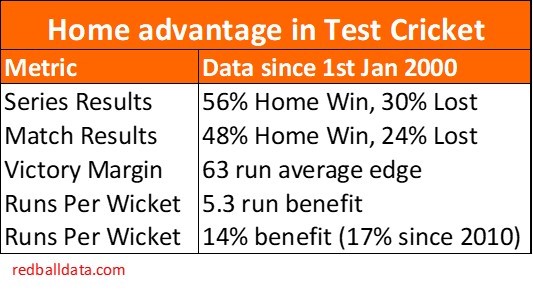
So how big is home advantage? Eight of the last ten Ashes series have been won by the hosts. Casting the net a bit wider, including all Tests since 2000, we can be a bit more precise and measure home advantage a number of ways:
Figure 1: Five measures of Home Advantage. All figures presented from the home team’s perspective. Tests since 1st Jan 2000, excluding Zimbabwe, Bangladesh, Afghanistan & Ireland
The key metric is the 14% difference in runs per wicket between home and away teams. All other effects are a consequence of that. Take a player with a theoretical average of 35 – at home he’ll average 37.4; away that drops to 32.6. Over the course of an average match the 17% difference translates to a 63 run total edge to the home team, which in turn means roughly twice as many home wins as away wins in matches & series.
The example of Rory Burns illustrates the effect of Away games: his county stats are excellent, but he has played six Tests, all away, and averages 25. It will take a while for his average to tick up from there, assuming he gets the opportunity. How much easier life could be if he’d started with a home series! I’ll wager that there are players whose careers stalled because they debuted away from home, and were lumbered with averages that would mark them as not-quite-good-enough. At present that’s just conjecture, it’s on the list for me to return to at a later date.
Home
advantage gets bigger as a series goes on
My intention was to look at series of 3+ Tests and show that tourists were coming unstuck in the first Test (fail to prepare, prepare to fail) and then acclimatising and improving. Easy piece of analysis, right? What follows are multiple attempts to show it, and finding the opposite effect: Home advantage gets bigger as a series goes on
Here’s the Test-by-Test view:
Figure 2: 1st Jan 2000 – 9th Feb 2019, Home advantage in series of at least three Tests. Percentage advantage refers to the differential in Runs per Wicket. Excluding Zimbabwe, Bangladesh, Afghanistan & Ireland. Note the large sample sizes.
Home advantage grows though a series. The increase is insignificant from first to second Test, before jumping for later Tests of the same series. This is marked by a significant decline in away runs per wicket in later Tests in a series. Scoring 2.2 runs fewer per wicket in the later Tests is roughly the equivalent of replacing Tim Southee with a breadstick (in terms of batting contribution).
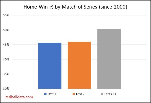
What does that mean for results? Well, if you are planning to follow your team abroad, you’d be wise to go to the early Tests in the series:
Figure 3: Home Wins increase noticeably for the third (and subsequent) Tests in a series. 1st Jan 2000 – 9th Feb 2019. Excluding Zimbabwe, Bangladesh, Afghanistan & Ireland
Worth noting that the extra home wins later in the
series come from both fewer draws and fewer away wins.
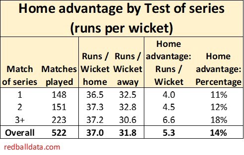
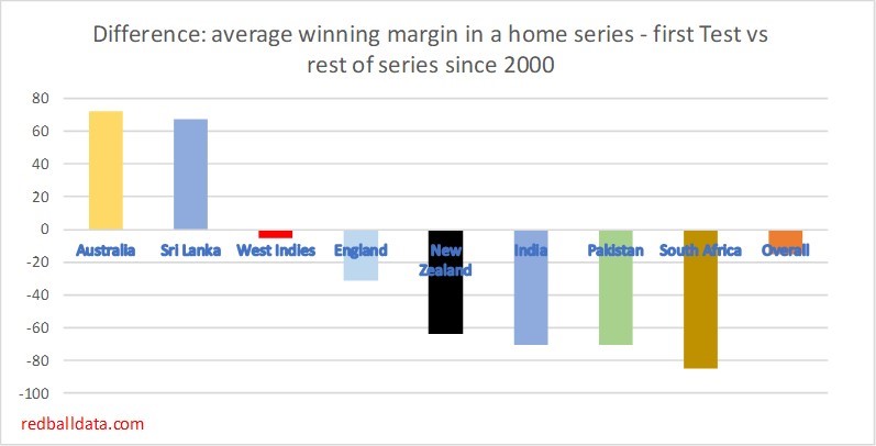
Now let’s consider first Test home advantage compares to the rest of that series (by country):
Figure 4: Relative home advantage in the first Test of a 3+ Test series as compared to the rest of that series. UAE not treated as a home ground for Pakistan. Victories by wickets are translated to runs based on the average fourth innings score. Draws are recorded as nil. 1st Jan 2000 – 9th Feb 2019. Excluding Zimbabwe, Bangladesh, Afghanistan & Ireland
Generally, home advantage is actually weaker in the first Test than later matches. But note the ‘Gabba effect in Australia – this traditional series opener is especially suited to players with experience in Australian conditions. That’s the exception – in most cases, home teams have more success later in the series.
Still not convinced? One more chart, and if you’re still not convinced you can give me both barrels on twitter (@edmundbayliss) and tell me I’m wrong!
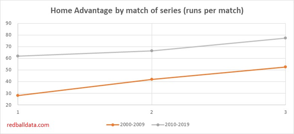
Figure 5: Home advantage by match of series. 1st Jan 2000 – 9th Feb 2019. Excluding Zimbabwe, Bangladesh, Afghanistan & Ireland
There’s a predictable trend in Figure 5: home advantage has grown over time.
Discussion
Let’s recap – home advantage is worth 12% in the first two Tests of a series, and 18% in the later Tests.
Why should this be? Three hunches:
Away teams find
themselves behind in the series; selectors panic. Perhaps a 21-year-old batsman
get picked, or an unbalanced side is selected in the hope of turning the tide. Keaton
Jennings being recalled to replace Foakes (a better batsman) in the recent West
Indies tour is a neat example of muddled thinking http://www.espncricinfo.com/story/_/id/25953448/jennings-foakes-england-chaos-two-tests-ashes
Modern players
don’t spend much time in home conditions, but built their technique there.
Playing a lengthy series allows home players to reintroduce tried and tested ways
of playing. Away teams don’t have that luxury, and can’t expect to make
technical changes mid-series.
Fatigue: a small
squad gets run into the ground by back to back matches.
So, there we have it – home advantage is significant and grows as a series goes on. More analysis is needed to establish why this is the case.
Dan Weston (@SAAdvantage) suggested that matches after the series had already been decided could be a factor that hadn’t been taken into account:
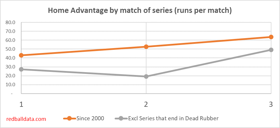
To exclude just the “Dead Rubber” games would distort the home advantage effect, because to do so would include only the early matches in those series (probably won convincingly by the home team). The right response is to ignore all matches in a series where that series ends in a “Dead Rubber”.
Figure 7: Home advantage measured in runs, both including and excluding series that are decided before the last match of the series. Note that excluding the one sided series reduces the sample size to roughly 300 Tests- so there’s a bit more volatility between first and second Tests in the series. This is likely to be by chance, rather than a genuine effect.
Excluding one-sided series shows lower home advantage (because it excludes big home wins when a visiting team can’t compete with a superior host team). The overall effect is the same though- home advantage gets markedly bigger in the later Tests.
Looking at 2016-2018 Test, County Championship and Second XI bowling data, and adjusting for the relative quality of that Cricket, we can rank the England qualified players.
I’ll use this for a 2019 preview a bit closer to the start of the season.
In the meantime, here’s a look at England selection. Given that County Cricket mainly takes place in April, May, August and September, it doesn’t necessarily replicate the conditions for home Tests in mid-summer (let alone away games).
2016-2018 Bowling records, selected England bowlers. Ranking amongst England qualified bowlers, 45+ Wickets.
It’s surprising just how far down the list Wood, Curran, Rashid and Ali are. While it’s hard to find good English spinners, the case for picking Wood and Curran (77 D1 Wickets at 33) is weaker.
There’s also support for Stokes taking on a greater share of the bowling, just as he did in the West Indies (sending down 29 overs per game).