England vs West Indies (July 2020) – Preview

I recommend you read this back-to-front. Like a newspaper: skip to the tables at the end, digest the stats, make your own mind up – then read my words and see if we’ve reached the same conclusion.

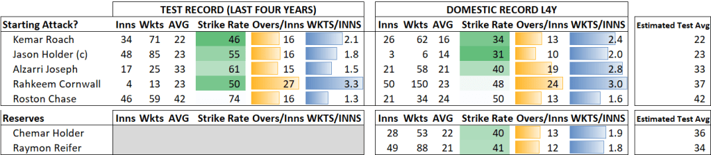
On paper this series is a mismatch – the fourth ranked team hosting the eighth. West Indies averaging 23 runs per wicket over the last three years, facing English bowlers in English conditions. Yet there are reasons to believe in the tourists: eight of their expected top nine are peaking, aged between 27 and 30. They could have the best Test opening bowlers right now in Kemar Roach and Jason Holder. Roach averages 22 over the last four years; Holder 23.

Talk is cheap. It’s easy to argue this either way. What does the data say?

By my ratings, England are 50 runs per innings stronger, a 59% chance of winning (West Indies 29%, Draw 12%). Bookmakers only give West Indies an 11% chance. Intriguing.

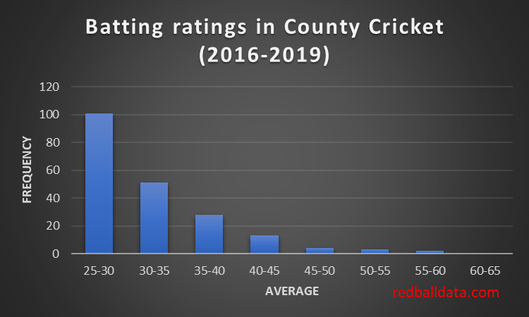
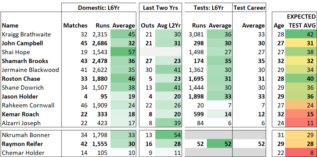
Do people underestimate this West Indian side? The difficulty of batting in the West Indies Regional Four Day Competition is roughly comparable with County Championship Division 1 – so the last-six-year domestic records of Brathwaite (avg 45), Hope (57) and Chase (46) indicate their underwhelming Test records are misleading. Note Hope hasn’t played a domestic game in three years. He averages 52 in ODIs, but it looks worryingly like he’ll never fulfill his Test potential. Modern cricket.

Some thoughts on the optimum makeups of the sides:

Holder is best at eight. West Indies’ strength is in bowling; their weakness in batting. With canny selection they can paper over the cracks. Jason Holder, Raymon Reifer and Rahkeem Cornwall could feasibly be 8-9-10 giving West Indies the best of both worlds. However, the lure of picking the best bowlers would lengthen the tail with a batsman being displaced (Holder, West Indies’ highest placed batsman in the ICC rankings, moving up to six as part of a five man attack). That would be a mistake – the West Indies win probability would drop by 4%.

West Indies only have one other decision to make: do West Indies need a front line spinner? This decision should be based on reading the pitch. If not, Roston Chase covers those overs. If they do, then J Holder, Cornwall, Reifer/Gabriel, Roach is logical. Cornwall isn’t the Test prospect he appears: expect a mid-30s average. While he has a fantastic domestic average (23) over the last four years, this is flattered by spinning domestic conditions. Remember that Chase also averages 24 in that period, but 42 in Tests.

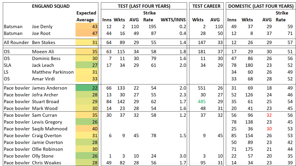
The hosts’ shaky top order means England have to pick a number eight that can bat – which limits their choices. If Jack Leach plays, then one of the batting bowlers (likely Chris Woakes) needs to play. Woakes loves bowling at home: in the last four years he averages 21. Alternatively, Moeen Ali could play: this is Stuart Broad’s best chance of joining Archer/Anderson/Stokes as England’s pace quartet. Broad may not make the cut– he’s played every home Test since 2012, but is sliding down the pecking order.

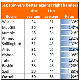
Leach (SLA) is the best slow bowling option. West Indies’ middle order is packed with right handers. Leach & Parkinson turn the ball away, so have an advantage. Leach also has the best county average over the last four years (23). Meanwhile Ali averages 40 against right handers. If Ali plays (for his batting), the West Indies should focus on seeing off the new ball, because favourable conditions await.

It doesn’t really matter which ‘keeper England choose. The gap was marginal when I looked at it before [link]. This just isn’t a debate that excites me- it’s a judgement call, and no criticism should be levied at selectors if it fails. Unlike Zak Crawley, who would be a bold and wrong selection, going against the publicly available data. His best first class season saw an average of 34. If he’s picked and fails, it’s not his fault- blame the selectors. If he succeeds, I will give them credit.

Both teams impress with the ball. The batting will decide the series. England at full strength are better than the West Indies. Most of that advantage comes from Root and Pope. Neither team has much in the way of batting reserves. With Root unavailable for the first Test, England have a lacklustre choice of alternatives. Ballance and Kohler-Cadmore aren’t in the squad. The replacements are c.14 runs per innings weaker than Root.

While the West Indies batsmen are at their peak, England are looking to the future. If England go 2-0 up (which is perfectly plausible), they could have six players aged 24 or under (Sibley, Lawrence, Pope, Bess, Curran, Mahmood) in the dead rubber to ensure the old farts don’t break down with three tests over 21 days. Need to keep something in the tank for Pakistan.

Look out for bowler workloads. Tests on the 8th, 16th, 24th July. James Anderson is 37 years old. Roach and Holder are easily West Indies’ best bowlers. This might have some anti-cricket effects: if the opposition are 200-1 chasing 260 on the fifth day, do you take your best bowler off the field to rest for the next Test? Don’t want to risk them in a lost cause. No problem to fatigue (not injure) Reifer or Archer, but not the star bowlers.

And a left-field hypothesis, which I don’t really believe: Stokes will fail with the bat because he needs a crowd. He feeds off it. Away from thousands of fans he isn’t the same player. In six years of county cricket he averages 25. In the UAE he contributed 88-6.

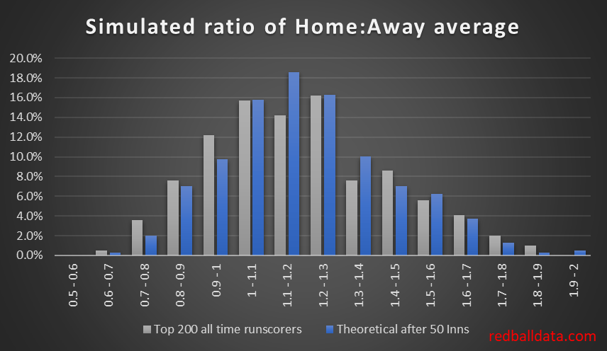
PS. I’ve cut home advantage in my model to 10% (from 20%) to reflect the lack of crowd. No idea if that’s the right thing to do. The Conversation reckons it’s nil for crowd-free football. Betfair podcast thinks it’s also nil.

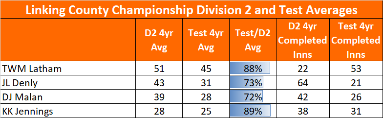
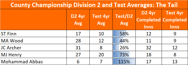
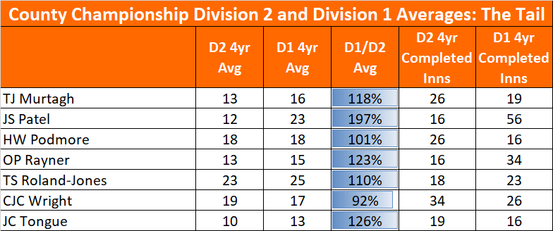
Appendix – Data tables

I had these spreadsheets in front of me as printouts when I appeared as a guest on three recent Betfair “Cricket only Bettor” podcasts, which you can listen to here, here and here.

West Indies Batsmen

West Indies Bowlers

England Batsmen

England Bowlers

Test partnerships – does it matter who bats with whom?

Does cricket lose something when we are dispelled of its myths? Some fictions are unhelpful, such as Michael Vaughan’s success without having thrived at county level. However, we like to believe in partnerships: every smile and punch of gloves boosting the batting of our heroes, spurring them on to greater heights.

Thus I write hesitantly – I am loathe to reduce cricket to a spreadsheet, even though I literally do that. Hopefully some unsolved X factors will remain after the stats revolution.

On to today’s topic. Last time we saw that right-left partnerships don’t influence white ball run rate. This post covers the currency of red ball cricket: averages. Does who you’re batting with impact your average?

Considering the period 2010 to today, seven pairs performed much better than expected based on the records of the individuals in that partnership. Two pairs performed worse. They are shown below, ordered by how surprising that out-performance is.

That’s nine outliers – seven good and two bad.

But what are the chances each outlier was just fluke? After all, Clarke & Ponting only had 20 partnerships in the 2010s. After this analysis of error bars on averages we have a way to answer that – by quantifying how likely it is that a specific average (eg. Jermaine Blackwood averaging 37 in England) is arrived at by chance, based on the sample size.

With 120 partnerships (min 20 innings) since 2010, we would expect six pairs to lie two standard deviations from expected average. Actually we have nine. On the face of it, that’s evidence that some duos do get a boost from batting together. However, two of the nine drop off the list with further scrutiny. Kayes and Iqbal happened to bat together more at home than away. Bell/Pietersen somehow had 19 of their 23 partnerships in the first innings. Adjust the calculations to reflect that, and we have seven outliers, whilst by chance we would expect to have six. In layman’s terms, if each duo batted together enough times, their partnership average would eventually reach their combined average.

Here’s the chart of all 120 players, plotting variance to expectation against frequency. Even with small sample sizes, most partnerships average within five runs of expectation.

Where does this leave us? Remembering that “absence of evidence is not evidence of absence“, the jury’s deliberations will continue, but they will now be leaning in favour of specific partnerships not making a significant impact on a player’s average. Cricket is a one on one sport, bowler against the batsman on strike.

***

PS. How did I arrive at the expected average for a partnership? Start with the mean of the post-2010 average of the two players in each partnership. Add 1.5 runs for any partnership that isn’t two openers, on the basis that one of the batsmen will start the partnership with their eye-in. Add 4.6% for the extras that would be scored in that innings. It’s a slightly different formula for when a senior batsman is with a tailender.

PPS. Why the cut-off in 2010? “No balls” dropped off then. Here’s the 50 year history of extras in Test cricket. Extras count towards partnership totals, so the maths gets more involved when extras vary significantly by year.

Batting ability in Test cricket is not normally distributed (it just looks like it is).

How is talent distributed in elite cricket? Bell curve (ie. normal distribution), or something else? Here I’ll argue that the distribution of ability is the tail of a normal distribution. The evidence is strong at county level, but rather weaker for Test cricket. As you’ll see, I’ve not let that stop me.

1. Marathon Running & County Cricket

Let’s start with a different sport. Here’s the distribution of running performances for millions of marathon runners:

Fig 1 – Distribution of marathon times. Taken from Allen et al.: Reference-Dependent Preferences: Evidence from Marathon Runners. See here.

The spread of marathon times across the population is broadly a bell curve, but there are some subtleties: firstly, that the unfit are less likely to take up long distance running (myself included), so the distribution is lopsided. Secondly, marathon runners appear to have target times, and performances are bunched around times like four hours.

Focus on the distribution of the elite – the quicker the time, the fewer runners are capable of it. Lots of runners at the bottom of the elite pile, then fewer and fewer as the pace goes up.

County cricket fits that pattern (based on my ratings of how players across 2nd XI and the County Championship would fare in Division 1). Loads of quite talented players who could just about make the grade, whittled down to 22 who would average over 40.

Fig 2 – distribution of redballdata county batting ratings, min 30 innings. Excludes overseas players.

2. Test Cricket

Fans of Occam’s razor might want to look away now. This section sees me building a house on sand.

My previous post demonstrated that averages are a function of luck and talent. We know the impact of luck, we have the actual averages. Thus we can work backwards to estimate the distribution of batting talent. I’ll now suggest a distribution of batting ability in Test cricket.

We start by making a graph of the averages of batsmen in Test Cricket. Looks a teensy bit like a bell curve, and nothing like the County chart. There’s only 300 players so it’s not a smooth distribution.

Fig 3 – Career averages, batsmen minimum 20 matches, since 1970, batting in the top six.

a. Talent Distribution in Test Cricket

However, selection isn’t perfect. Nor is there a continuous supply of Test standard cricketers in each country. This means a sprinkling of selections who are of a lower standard. Also, each country is a different standard. This means the true distribution of Test batting ability is the sum of the curves for each country.

Putting all that together, the distribution takes the form:

Fig 4 – Suggested distribution of talent in Test Cricket. Each curve is the tail of a normal distribution plus a small number of weaker players. To reflect the relative strengths of cricketing nations (and variation over time), the Overall curve is the sum of three curves (for an inferior, average, and superior team).

That yellow curve is probably smoother in the real world. Still, not terrible as a first attempt at answering the question “what does the distribution of Test batting talent over the last 50 years look like”?

b. The Luck Curve

The median player had 75 completed innings, so I’ve used that to derive the spread in averages (versus “true” averages). A reminder: this comes from a simulation of many careers.

Fig 5 – impact of luck on average for a top order batsman that has been dismissed 75 times.

Strictly, I should merge many luck curves – a tight one for Tendulkar (292 dismissals, a wide one for Moin Khan (26 dismissals). Still, every journey starts with a single step.

c. Talent * Luck = Performance

We now combine the Talent and Luck curves (probability densities) and compare them to the observed distribution

Fig 6 – Actual batting averages vs a Theoretical distribution based on proposed luck and talent curves

Not a bad fit. Naturally, the Actual (blue) curve is noisy as there are only 300 players that meet the criteria for inclusion. There are fewer players with very high averages than the talent curve I’ve derived would indicate – implying the real talent curve drops off more steeply than mine.

Discussion

What use is knowing how talented players are (rather than just knowing how well they performed)? In order to judge if a player has been unlucky or is unsuited to Test cricket, one needs to know the level of talent they need to have.

If you feel uneasy about the hand-waving approach I’ve applied here, then don’t worry – because so do I. Tinkering to make one curve look like another (noisy) curve is not the most rigorous analysis I’ve done. Just take away the message that luck plays a big role in averages, and we can’t yet use numbers to know how talented Test batsmen really are.

Further reading

Always worth seeing if someone has asked this question in baseball. Here’s analysis that finds batting ability would be normally distributed if you assume fielding is 30% of the value of a player. I can’t comment on baseball, but for cricket that figure is too high. Thus it’s an interesting technique, but not contradictory to my curves. If one could quantify the value of fielding (and/or other attributes) for top order batsman, then the approach in the linked piece could be replicated.

***

*Since 1970, batting in the top six, min 20 matches

Test cricket’s evolution and professionalism

Imagine a sport where only a handful of its best players participated full time. There would be an elite few head and shoulders above the rest, and a lot of weak players. That’s how the era of amateur cricket looks statistically.

Here I’ll demonstrate that the quantum leap in Test Cricket was the 1960s, with professionalism ensuring the brightest talent wasn’t lost to the game.

A 1950’s professional cricketer could earn twice what a manual labourer could.[1] A good wage, but sporting careers are short. There’s no way cricket was attracting all the talent that was out there. In 1963 British county cricket turned fully professional. I don’t know about the evolution in other countries, but it’s striking that in 1962 Richie Benaud was described as “a newspaper reporter by profession” when being recognised as one of Wisden’s Cricketers of the Year.

In the two decades after the Second World War, the depth of talent increased. We can see that in the distribution of batting averages:

Fig 1 – Top order Test averages. Min 10 Tests.

The 1960s distribution reflects a mature sport: lots of players of similar ability, a sprinkling of duffers, and few standing out from the crowd.

Contrast that with the 1930s – over a quarter of the players averaged over 50. Admittedly there were only 42 players that met the criteria, and averages were noisier because there were fewer Tests played then. Bradman’s average should be considered as a function of the era he played in: in the 1930s four others averaged over 65, nobody has achieved that in the last four decades.

There were far fewer batsmen averaging under 25 by the 1960s: this will be a function of a more talented player pool. Interestingly, this wasn’t driven by improving the batting of wicket-keepers: they averaged two runs per wicket less in the 1960s than the 1930s.

Here’s the trend year by year:

Fig 2 – “Mean absolute deviation” is a measure of the extent to which performances differ from the mean. The higher it is, the more outliers there were. While there is a lot of noise, the trend is of a reduction over time.

But what about all the developments since then- improvements in bats, coaching, and technique? These improve all players similarly, so don’t impact the mean absolute deviation. Thus, they aren’t detected by this technique: there will never be one number that says how high the standard of cricket was at a point in time.

For completeness, here’s the decade-by-decade view:

Fig 2 – “Mean absolute deviation” by decade. Top order batsmen, min 10 Tests.

The maturity of Test Cricket was complete by the 1960s. Note that there wasn’t significant impact from the addition of Test teams through the years: indicating sides were generally added when ready (some would say we waited too long).

Professionalism swelled the ranks of the most talented. What we don’t know is the proportion of the high potential players that ever play cricket: could Rooney have been better than Root?

The logical extension to this maturity analysis would be to look at T20 and/or women’s cricket. Let me know if you’d find this interesting.

***

P.S. while researching this piece, a story from the late David Sheppard about the social division between amateurs and professionals (like Tom Graveney) caught my eye…

When I was at Cambridge we played against Gloucestershire at Bristol. I had made some runs, and, as we came off the field, Tom Graveney, with whom I had made friends in 2nd XI matches said, “Well played, David.” A few minutes later the Gloucestershire captain walked into our dressing-room and came over to me. “I’m terribly sorry about Graveney’s impertinence,” he said. “I think you’ll find it won’t happen again”.[2]

[1] Rain Stops Play, Andrew Hignell

[2] Amateurs and professionals in post-war British sport, edited by Dilwyn Porter & Adrian Smith

Leg spin: What we can learn from Statsguru

My statistical goal is a theory of everything: expected averages for any situation. So far I’ve excluded the influence of match ups (specific bowler vs batsman) as being Very Difficult Indeed. That ends now: join me as I dip a toe into that field, starting with some analysis of leg spinners in Tests.

**Update 24/04/2020 – the methodology below was flawed: the Statsguru page I used reflects the score a batsman was on when dismissed, rather than the head-to-head score. Interestingly, after further work it looks like the conclusions were reasonably accurate, even if the workings weren’t.**

1. Leg spinners and favour right handers

The logic for it being more expensive to bowl leg spin (LS) against left handed batsmen (LHB) in white ball cricket is that the batsman can play with the spin, and minor errors in line provide opportunities for scoring. Here’s CricViz on that topic.

In longer format cricket, I expected leg spinners to be agnostic to the batsman’s stance. Against right handers (RHB) a straight line threatens every kind of dismissal apart from timed out, while for LHB a line well outside off can still threaten the stumps and both edges, while asking the batsman to play well away from their body.

What does the data show? At the highest level of Test Cricket, nine of the ten leg spin bowlers sampled favour right handers. Expect a leggie to average 22% more against left handers in Tests.

Shane Warne took 708 Test wickets at 25, yet against LHB he was average. Still, that makes him significantly better than his competitors – none of the other recent leg spin bowlers averaged under 35 against LHB. What’s the reason? I think it’s the required line against left handers making bowled and LBW less likely. Against right handers bowled and LBW make up 37% of dismissals. For left handers that drops to 31%.

2. Elite leg spinners come into their own against the tail

There’s a neat split between Warne, MacGill, Kumble, Ahmed and the rest. The top four took 1,742 wickets at 28, while the other six took their wickets at 39. Individually, there’s not enough data on the six lesser players – so I’ve lumped them together to compare their careers to the elite four.

The ratio of Elite vs Second Rate averages reveals the trend: Elite leg spinners bamboozle lower order batsmen (anyone with a career average under 20).

What does this mean for strategy? Captains will intuitively know that a strong leg spinner is an asset against the tail. If you have an inferior leg spinner, how should you deploy them? I would argue they are best used against the top order (once the ball is no longer new), in order to keep the best bowlers fresh. It’s a question of managing resources and getting the best out of the attack over a 90 over day.

3. Elite bowlers are flattered by bowling at weaker batsmen

The weaker leg spinners claimed 58% of their wickets against batsmen who average 30+. For the elite four that figure is just 51%.

The above impact can flatter averages; for instance Stuart MacGill (42% wickets against top order, career average 29) was not so much better than Devendra Bishoo (61% wickets against top order, career average 37).

A full system would include this when rating bowlers: a rough estimate says MacGill’s true rating was 31, whilst Bishoo’s true average was 35. A quick check shows these adjusted averages are more in line with FC averages, indicating there’s a ring of truth to this.

Methodology

I’ll level with you – there are some assumptions here. Cricinfo’s excellent and free data gives a bowler’s averages split by batsmen (here’s MacGill’s). However, this doesn’t cover how many runs were conceded against batsmen who they haven’t dismissed. I’ve attributed the unallocated runs to batsmen in proportion to their average and number of matches played against that bowler.

***

That was fun! We’ve seen a hint of what matchups can do and I’m very late to the party. That said, I’ll stick to my guns: most patterns are just data mining and we need proper evidence (at the level of the above or better) before drawing conclusions. Those conclusions are best done at the “off spinner vs opening batsman” level rather than the “Moeen Ali to Dean Elgar” level.

Top five Test batsman to debut in the last eighteen months

I was on the latest Cricket only Bettor podcast talking about promising Test cricketers. Here are my thoughts in more detail.

It can be difficult to judge Test players after a few innings. Their Test average is likely to be meaningless. First Class records feature innings played a decade ago. The concept of “First Class” is lovely, but not all FC bowling attacks are created equal. South Africa has two levels of FC cricket, England has a couple of rounds of games against students each year.

I’ve used player records over the last four years in the top First Class tournament of their country to pick out the best batsmen that are just embarking on their Test career. Note that expected averages below are from here onwards (rather than career averages which should be adjusted up/down based on performances to date).

5. Oshada Fernando. Expected Test average 37

FC avg just 37 over his career, but this rises to 50 over the last four years. Likely to be under-rated.
39 sixes in nine FC matches last season (Jos Buttler gets a six roughly every other FC innings). Also averaged 74 last year.

Test average of 46 comes from four away Tests (in SA and Pakistan).
Hit 75* as Sri Lanka beat South Africa 2-0 in South Africa. (Before that only England and Australia had won a series in South Africa).

In December Pakistan soundly beat Sri Lanka in Karachi. Sri Lanka subsided for 212, with only two batsmen passing 20. One of those two was Fernando – he made 102.

4. Rassie van der Dussen. Expected Test average 40.

Took the long route to Test cricket: T20I then ODI experience before being unleashed in whites aged 30.

Tasted success in the 2019 World Cup with three fifties in six innings, even as SA’s campaign faltered (finishing seventh in the group).

Reasons to believe: last four years scored 2,302 runs at an average of 55. Some positive murmurs in the media from his first three Test innings.

3. Zubayr Hamza. Expected Test average 42.

1,563 runs at 50 L4yr. Career FC avg 49.97. Just 24 yrs old, quite a prospect.

Makes the list purely on First Class performances. Top order batsman, Poor start to Test career, but has a higher first class average than van der Dussen. Averaging 21 after eight innings, but I’m keeping the faith

2. Marnus Labuschagne. Expected Test average 45

He’s just racked up the most runs scored by an Australian in a five-match summer. So why isn’t Labuschagne #1? His FC record lately isn’t that good – four year Sheffield Shield average of 35.

His evolution is interesting. Averaged 25 in the Sheffied Shield in 2018/19, and only 26 over his first five Tests to 31st March 2019.

Began 2019 as an unknown (to me) player in an unfancied Glamorgan team but scored 1,114 at 66 and followed that up with a great run for Australia.

Will he keep it up? He’s surely not come from nowhere to be the best since Bradman. Has he? It depends on how you judge a player. One year? Two years? Four years? Their whole career?

1. Ollie Pope. Expected average 48.

Didn’t get past 30 in his first five Test innings, has back to back fifties since then.
Missed most of 2019 with a shoulder injury, though that doesn’t seem to have affected his game.
Hit an unbeaten double hundred in August against a Hampshire attack with four international bowlers (Edwards, Abbott, Holland, Dawson).
Has only played 34 first class matches – so there’s some uncertainty on exactly how good he is.

***

The list started as best batsmen to debut in 2019, but I could only find three batsmen that excited me enough. Thus Pope and Labuschagne got parachuted in and the list was extended to the last 18 months. Honourable mentions go to Mayank Agarwal and Rishabh Pant who would probably have made the cut if I’d been looking at the last 18 months from the start.

Chart & Chat: A review of the 2010s

The 2010s end today. I’ve no team of the decade for you, just a chart and its implications.

Fig 1 – Batting and Bowling performances in Tests and T20Is this decade. Ratings are based on averages in Tests and Strike/Economy Rates in T20Is. Higher numbers are good – eg. India averaged 5% less with the ball in Tests than the average team. Ireland excluded as played too few games.
  1. The Big Three does not include England in Test Cricket. It’s South Africa / Australia / India based on the last ten years (and the last week).
  2. West Indies were not good at Test Cricket in the 2010s. Their record against the top three teams was W0 L21 D9. Problematic for the sport, if number eight can’t win in 30 attempts against the top three.
  3. T20Is will be closer than the average Test – As well as the obvious (one short innings rather than two long ones) the teams are far more evenly matched in 20-20 than Tests. Australia were one of the strongest teams this decade. Their W/L ratio was 1.5 in Tests but only 1.35 in T20Is.
  4. Bowling is not the differentiating factor in T20Is. This is odd, because weaker bowling should be punished by the six hitting machines out there in 20-20. Look at the distribution of the two colours of dots: the Orange ones for Tests form a line from the bottom left to top right. If you are strong in one discipline you will be strong in the other. It doesn’t work that way for 20-20: batting makes the difference.
  5. Two clusters of T20I performance: the top tier is Australia, India, England, New Zealand, South Africa. The next level down is West Indies, Sri Lanka, Afghanistan, Pakistan.
  6. What happened to New Zealand’s Test bowling this decade? Were they weak for a few years and I didn’t notice?

Please note that apart from points three and four, this chart is backwards looking: it does not have predictive power. Still, sometimes nice to take stock and see the wood not the trees. There’s a lot of noise out there, don’t miss the longer term trends.

Happy new year.

Lower order CC Division 2 runs – are they predictive of Test performance?

Jofra Archer is struggling with the bat in Test cricket, averaging eight and lengthening the tail. Yet he has a First Class average of 26. Is he getting an easy ride batting down the order for Sussex, then being found out at the highest level? Let’s find out.

Recap – Linking Division 2 and Test Batting

Previous workings showed that a played would expect to average 72% as much in Tests as they do in Division 2 (D2). There isn’t that much data though: most Test players are drawn from the top division. Just four players have over 20 completed innings at both levels over the last four years:

Not a bad fit – D2 averages do have reasonable predictive power of Test performance for batsmen (please take note Mo Bobat). You just need to play a decent number of games in both formats.

But what about tail enders in Tests?

Most of the overseas players in D2 are batsmen. There aren’t many bowlers in D2 to have also played Test cricket lately. Here’s the data for the five lower order batsmen to have eight or more completed innings in Tests & D2:

Remember none of these players has 20 completed innings in both formats, so expect volatility. Archer and Mohammad Abbas are the outliers: Archer averaged nearly four times as much in D2, while Abbas has a slightly higher Test average.

Across the five players, their Test average is 63% of their D2 batting average (for all players this figure is 72%).

Tail enders in D2 vs D1

Data is lacking on tail enders in D2 and Tests. Let’s answer a different question. If we are happy with the standard of D1, then all we need to do is demonstrate similar averages for the lower order in D2 and D1, and we can conclude that Jofra Archer is good at batting.

The above chart is for all batsmen that have >15 completed innings in D1 and D2. If anything the trend is for higher averages in D1. Can’t explain that, but at least that gives some comfort that the tail isn’t getting an easier ride in the lower division.

Conclusion

Jofra Archer would be a very unusual player if he continues to average under ten in Tests. I would expect him to average 17 in Tests based on all available red-ball innings. It just happens that the County Championship has seen the best of his batting, and Test cricket the worst.

Test batting: do some players gain an extra boost from playing at home?

David Warner seems to have a preference for familiar conditions. After 82 Tests he averages 66 at home, 33 away. 2019 has been a rollercoaster: averaging 9.5 touring England, then dismissed just three times amassing 551 runs in Australia.

Would we expect that trend to continue? No. I’ll exhibit two bits of evidence against some players being disproportionately dominant at home. Firstly tracking a recent crop of players, and secondly by demonstrating that the great players in home conditions are what we would expect from chance.

Recent History

We consider players that did relatively well at home up to a point in time (31/12/2016), and see if this continued, or if they regressed to the mean.

Fig 1 – Home and Away batting averages in Test Cricket. Split before and after 31st December 2016. Min 10 completed innings Home and Away pre 31/12/16, min 20 completed innings Home and Away post 31/12/16. Home advantage means the average player’s ratio is just under 1.2.

The above table indicates Home : Away Average Ratio (HAAR) history is a poor predictor of future returns. Elgar was great then OK. Amla was rubbish then brilliant. Plotting the data shows just how scattered the 12 data points are.

Fig 2 – Home to Away average ratios batting in Test Cricket. Split before and after 31st December 2016. Min 10 completed innings Home and Away pre 31/12/16, min 20 completed innings Home and Away post 31/12/16.

Putting it another way, if you had spent your Christmas 2016 holiday seeking home ground heroes, you would have been wasting your time*. Pujara, Broad and Elgar had HAAR ratios around 2 (just like Warner does now), but past performance is no guarantee of future success – all three of them subsequently performed no better than average.

And the players that favoured touring? Three of the four who were stronger away pre-31/12/16 flipped to subsequently be better at home. The one exception was Ben Stokes: in his career he averages 36 at home and 38 away. Take that nugget with a pinch of salt: if Stokes is better on tour why does he average 44% more batting at home in ODIs?

All time

Now to compare HAARs for Test cricket’s highers runscorers vs the theoretical distribution after 50 innings at home and 50 away:

Fig 3 – Actual Home:Away Average Ratios for the top 200 runscorers in Test cricket, compared with a simulation of 50 innings at home and 50 away.

Randomness plays a huge part (possibly up to 100%) in explaining the variation in Home:Away Average Ratios of Test cricketers.

There are other factors I’ve not included (for instance, a player might only struggle in swinging conditions). If there are specific cases where you think a player thrives only at home (or away), then please let me know.

Where does this leave us? Hopefully (for Warner’s sake) he has a few more years of Test cricket in him. That would also be useful for this blog – I look forward to reporting at the end of 2021 that Warner’s HAAR over the last two years has been the standard 1.2, and that past outperformance at home is no guarantee of future success.

*An aside – there’s a line from I Robot “I’m sorry: my responses are limited – you must ask the right questions”. While I wouldn’t normally take lessons from fictional holograms, I like the message in this. You can do decent-looking research, but if you start with the wrong question you’ll be wasting your time. In this example, “who are the best batsmen in home conditions” is the wrong question, one should ask “is there anything special about the ratio of a batsman’s home average to their away average?”

The case against Zak Crawley

Running England’s first innings (NZ vs Eng, 29th Nov 2019) through my model told me that Zak Crawley had a median first innings score of 12. Absurdly low.

Rather than just spout that opinion in a tweet, I’ll walk you through how the model got there, and we’ll see if there are any gaps in logic. Have England made a terrible selection?

Zak Crawley’s County Cricket Record – Average 31

County Championship Division Two: 2017-18 – Runs 830. Dismissed 30 times. Average 27.7

County Championship Division One: 2019 – Runs 820. Dismissed 24 times. Average 34.2.

Second XI Cricket: 2016-18 – Runs 708. Dismissed 22 times. Average 32.2.

Redballdata.com Ratings – Expected D1 Average 30 – Rating those performances, and placing more weight towards recent performances, Crawley’s expected Division One average next year is 29.6.

Adjusting for Age – Expected D1 Average 30.4 – Zak Crawley is 21. He gets a c.3% boost to his expected average because his average is based on runs scored when he was 18/19/20.

Adjust for this innings – Expected Average 19.4 – A Test Match, away, against a strong New Zealand attack is much harder than a county game. That has a severe impact on average.

Run all that expected average of 19.4 through the model, and it predicted a median score of 12.0. What you would expect from a number eight batsman, not a specialist.

Gaps and biases

Let’s look at this from England’s point of view – why is Crawley in the team? I can think of three reasons:

  • He was in the squad, they didn’t really expect him to play. (That links to home advantage getting bigger as a series goes on: in this case it’s because injury means that a squad player, there to gain experience, gets drafted into the team.
  • England selectors use a different age curve and/or bias towards recent matches – bumping up Crawley’s expected average (along with every other young player).
  • Something in performance specific data (that doesn’t show up in averages) makes the England selectors think he’ll be especially suited to batting in New Zealand.

What happened?

Crawley made one run before Wagner got him. That additional innings has moved his expected average down a little more.