
How is talent distributed in elite cricket? Bell curve (ie. normal distribution), or something else? Here I’ll argue that the distribution of ability is the tail of a normal distribution. The evidence is strong at county level, but rather weaker for Test cricket. As you’ll see, I’ve not let that stop me.
1. Marathon Running & County Cricket
Let’s start with a different sport. Here’s the distribution of running performances for millions of marathon runners:
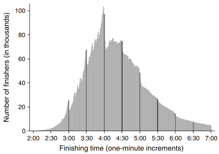
The spread of marathon times across the population is broadly a bell curve, but there are some subtleties: firstly, that the unfit are less likely to take up long distance running (myself included), so the distribution is lopsided. Secondly, marathon runners appear to have target times, and performances are bunched around times like four hours.
Focus on the distribution of the elite – the quicker the time, the fewer runners are capable of it. Lots of runners at the bottom of the elite pile, then fewer and fewer as the pace goes up.
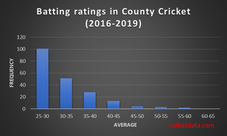
County cricket fits that pattern (based on my ratings of how players across 2nd XI and the County Championship would fare in Division 1). Loads of quite talented players who could just about make the grade, whittled down to 22 who would average over 40.
2. Test Cricket
Fans of Occam’s razor might want to look away now. This section sees me building a house on sand.
My previous post demonstrated that averages are a function of luck and talent. We know the impact of luck, we have the actual averages. Thus we can work backwards to estimate the distribution of batting talent. I’ll now suggest a distribution of batting ability in Test cricket.
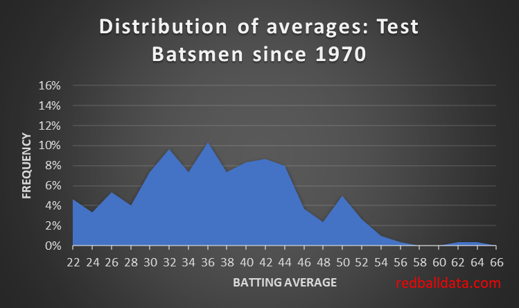
We start by making a graph of the averages of batsmen in Test Cricket. Looks a teensy bit like a bell curve, and nothing like the County chart. There’s only 300 players so it’s not a smooth distribution.
a. Talent Distribution in Test Cricket
However, selection isn’t perfect. Nor is there a continuous supply of Test standard cricketers in each country. This means a sprinkling of selections who are of a lower standard. Also, each country is a different standard. This means the true distribution of Test batting ability is the sum of the curves for each country.
Putting all that together, the distribution takes the form:
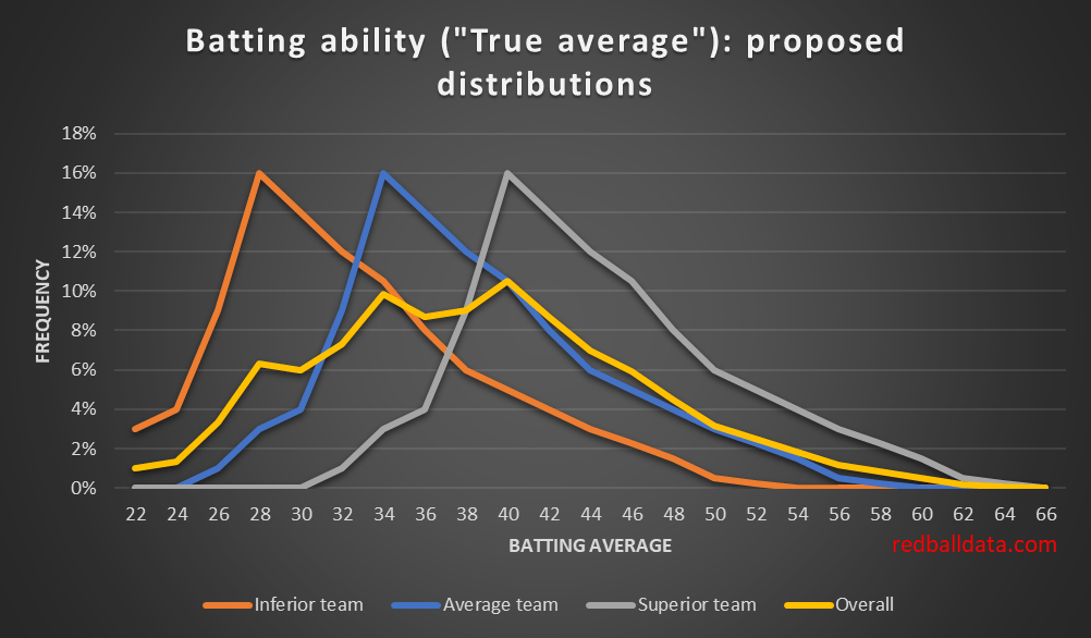
That yellow curve is probably smoother in the real world. Still, not terrible as a first attempt at answering the question “what does the distribution of Test batting talent over the last 50 years look like”?
b. The Luck Curve
The median player had 75 completed innings, so I’ve used that to derive the spread in averages (versus “true” averages). A reminder: this comes from a simulation of many careers.

Strictly, I should merge many luck curves – a tight one for Tendulkar (292 dismissals, a wide one for Moin Khan (26 dismissals). Still, every journey starts with a single step.
c. Talent * Luck = Performance
We now combine the Talent and Luck curves (probability densities) and compare them to the observed distribution
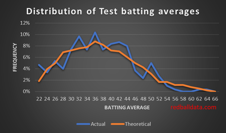
Not a bad fit. Naturally, the Actual (blue) curve is noisy as there are only 300 players that meet the criteria for inclusion. There are fewer players with very high averages than the talent curve I’ve derived would indicate – implying the real talent curve drops off more steeply than mine.
Discussion
What use is knowing how talented players are (rather than just knowing how well they performed)? In order to judge if a player has been unlucky or is unsuited to Test cricket, one needs to know the level of talent they need to have.
If you feel uneasy about the hand-waving approach I’ve applied here, then don’t worry – because so do I. Tinkering to make one curve look like another (noisy) curve is not the most rigorous analysis I’ve done. Just take away the message that luck plays a big role in averages, and we can’t yet use numbers to know how talented Test batsmen really are.
Further reading
Always worth seeing if someone has asked this question in baseball. Here’s analysis that finds batting ability would be normally distributed if you assume fielding is 30% of the value of a player. I can’t comment on baseball, but for cricket that figure is too high. Thus it’s an interesting technique, but not contradictory to my curves. If one could quantify the value of fielding (and/or other attributes) for top order batsman, then the approach in the linked piece could be replicated.
***
*Since 1970, batting in the top six, min 20 matches
