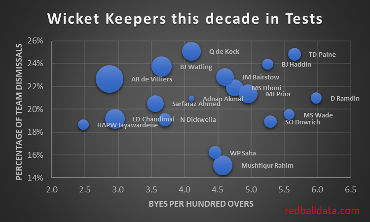
A good wicket keeper takes their chances, scores runs, and doesn’t allow many byes.
Only one of those can be easily measured – we use the batting average.
For the others, a proxy will have to do: percentage of team dismissals (measuring ability to hold catches), and byes per hundred overs (in lieu of measurement of fielding errors).
Here’s a chart showing those three measures (the larger bubbles are higher batting averages).
Fig 1: Wicket keepers who have played >20 Tests during the 2010s.
Now we are getting somewhere. The ideal player is at the top left with a big bubble. AB de Villiers wins. There’s insight in this chart, Adnan Akmal’s career passed me by – but through the above we can see a decent gloveman, albeit not up to the batting requirements of Test cricket.
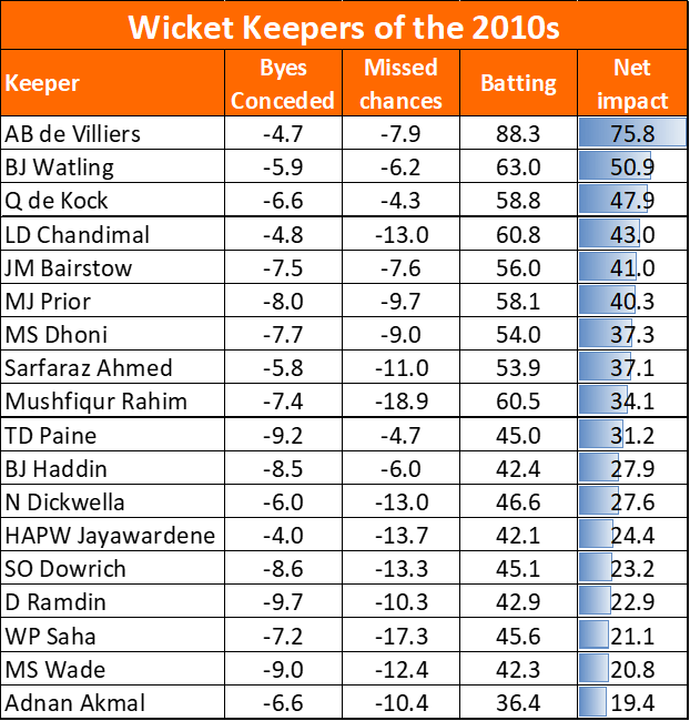
How about comparing players? De Villiers beats Mushfiqur Rahim on all three measures. But what about Tim Paine vs Sarfaraz Ahmed? We need to apply a weighting to each factor. Here’s my estimate and why:
Byes: runs impact = Byes/100 overs*1.62 because there are 162 overs in the average match.
Average: runs impact = Average * 1.48 (because the average wicket keeper is dismissed 1.48 times per match.
Percentage of team dismissals: runs impact = (% team dismissals – 28%) * 146.5 (I’ve estimated 4.5 dismissals per match for the keeper that takes 100% of chances, which would be 28% of team dismissals. At 32.6 runs per wicket, the perfect keeper is worth 146.5 runs more than a non-catching keeper. All keepers are between 0-146.5).
Here’s the same players ranked according to those weightings:
Fig 2: Wicket keepers who have played >20 Tests during the 2010s, now rated according to the weightings above.
AB de Villiers is comfortably the Red Ball Data Wicket Keeper of the Decade (RBDWKotD). I’m sure he’ll be chuffed. Was he flattered by averaging 59 with the gloves? No – he averaged 57 overall this decade.
There are secondary effects which one could measure (for instance, a left handed first slip taking chances from the keeper, reducing the number of dismissals). One might also want to consider intangibles, such as the ability to be distractingly inane, or contribute to strategy. These are judgemental, and I’m not qualified to opine on them.
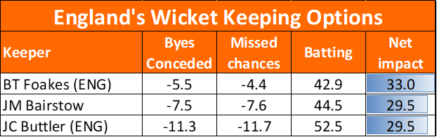
There’s a point at the end of all this. Should Ben Foakes be in the England team?
Fig 3: Rating England’s best available wicket keepers
Wow, that’s surprised me. It has changed my mind – I was expecting this to vindicate the selection of Jos Buttler. If Foakes is as good a keeper as we are told, it is sufficient to outweigh his inferior batting. There is little to choose between Jonny Bairstow and Buttler. Note that the usual disclaimer applies: need at least 20 Tests to judge, and only Bairstow has hit that threshold. Oh, and I’ve used my (more detailed) batting ratings for this chart, while Fig 2 uses averages while keeping wicket in Tests.
Running England’s first innings (NZ vs Eng, 29th Nov 2019) through my model told me that Zak Crawley had a median first innings score of 12. Absurdly low.
Rather than just spout that opinion in a tweet, I’ll walk you through how the model got there, and we’ll see if there are any gaps in logic. Have England made a terrible selection?
Zak Crawley’s County Cricket Record – Average 31
County Championship Division Two: 2017-18 – Runs 830. Dismissed 30 times. Average 27.7
County Championship Division One: 2019 – Runs 820. Dismissed 24 times. Average 34.2.
Second XI Cricket: 2016-18 – Runs 708. Dismissed 22 times. Average 32.2.
Redballdata.com Ratings – Expected D1 Average 30 – Rating those performances, and placing more weight towards recent performances, Crawley’s expected Division One average next year is 29.6.
Adjusting for Age – Expected D1 Average 30.4 – Zak Crawley is 21. He gets a c.3% boost to his expected average because his average is based on runs scored when he was 18/19/20.
Adjust for this innings – Expected Average 19.4 – A Test Match, away, against a strong New Zealand attack is much harder than a county game. That has a severe impact on average.
Run all that expected average of 19.4 through the model, and it predicted a median score of 12.0. What you would expect from a number eight batsman, not a specialist.
Gaps and biases
Let’s look at this from England’s point of view – why is Crawley in the team? I can think of three reasons:
He was in the squad, they didn’t really expect him to play. (That links to home advantage getting bigger as a series goes on: in this case it’s because injury means that a squad player, there to gain experience, gets drafted into the team.
England selectors use a different age curve and/or bias towards recent matches – bumping up Crawley’s expected average (along with every other young player).
Something in performance specific data (that doesn’t show up in averages) makes the England selectors think he’ll be especially suited to batting in New Zealand.
What happened?
Crawley made one run before Wagner got him. That additional innings has moved his expected average down a little more.
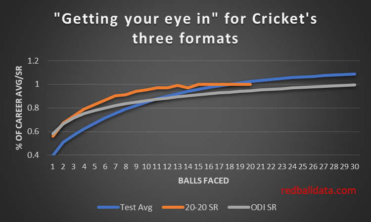
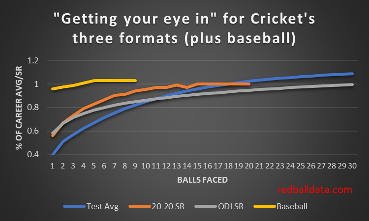
As ever shorter forms of Cricket proliferate, fast starters with the bat are becoming more valuable (just ask Dane Vilas). Let’s take stock of how players start across the three formats.
Tests, ODIs, and 20-20 are essentially the same game. Each match starts on a fresh pitch, with different ball, bowlers and climatic conditions to the last game. It takes more than one over to get one’s eye in, so batsmen are simultaneously settling in against multiple bowlers no matter the flavour of Cricket they are playing. The key differences which might impact how batsmen settle in are the white ball deviating less than the red ball, and the intent of batsmen differing.
How do we measure how settled a batsman is in each format in a given stage of the innings? In Tests we can use a batsman’s average ball-by-ball. However, in white ball Cricket Strike Rate is the prize (a cynic might suggest the curves suit my story so I’ve cherry picked).
The first thing to note is that these curves are quite similar – 20-20 batsmen really do take time to go through the gears. I’ll wager the slow acceleration is not through lack of effort. Players will be going as fast as they think they can: accelerating faster risks their wicket.
Data sources
Normally, this site is based on numbers I’ve crunched. This piece is an exception – while the ODI analysis is my own, I’ve based the 20-20 curve on this piece from sportdw.com. An aside – I looked at this back in 2017, and the bookmakers weren’t getting their “what happens next ball” odds right. Wish I’d been in a position to capitalise, but with a young family such activity was very much on the back burner. Anyway, it’s a fine post from sportdw.com, so take a look.
For Test matches I’ve used the analysis mentioned in my last post, Bayesian survival analysis of batsmen in Test Cricket. I had to make some assumptions to take Stevenson & Brewer’s player specific data and create a general case. Any errors in that process are mine – if you’d like to know about “getting your eye in” for Test Cricket, please read their work.
The current state
Let’s think about this behaviour from a theoretical perspective: in any innings a team are looking to make the best use of their resources. In Tests that’s as simple as maximising runs per innings: pick players that score the most runs per wicket, regardless of whether they start badly then get good, or quickly settle but then don’t improve much. Appraising Test players is easy – just look at the average*!
ODIs and 20-20s need to manage two scarce resources: wickets and balls. In 20-20 the number of overs is more of a constraint than in one day Cricket, which is to the advantage of faster starters. After 12 balls a 20-20 batsman is at full speed, while an ODI player is only scoring at 90% of their career SR.
What happens next
Data on 20-20 is everywhere. That’s partly why I don’t focus on it: the people that analyse 20-20 for a living are doing a great job. Seeing what’s available publicly, I can only imagine what depth of analysis the richest franchises have locked away on their laptops! I would be very surprised if there aren’t “getting your eye in” curves for each batsman, and teams optimising batting orders to get the fast starters into the right roles, alongside the high-average-slow-start-but-quick-when-they-get-going types.
Personally, I like a blunt approach – and assume all players play themselves in in the same way. Partly this is because I lack data – so have to make assumptions else I’d never have a model. Ultra short form games derived from Cricket will test that approach, and we will learn more about Cricket over the next couple of years.
Comparison with baseball
Baseball is a little like Cricket. Yet batters are up and running after just a handful of pitches. Why? A combination of there being only one pitcher, the ball not bouncing (so the ground matters less), and long breaks between innings mean that there’s limited benefit from repeated plate appearances in a game. Adding the yellow line for baseball shows just how similar the curves for Cricket’s three formats are. For now.
*For consistency I should say “factor in how many innings they have played, whether they were home or away, their record in each competitor adjusted for difficulty, what number they were batting, the grounds they were playing on, how old they are, which attacks they played against, what innings of the match each innings was” – but my writing barely flows at the best of times; that detour would not have been helpful. Hopefully you know what I meant.
I have a theory that openers are better than middle order batsmen with the same average. If someone averages 35 against the new ball, that has to be better than averaging 35 against the third change bowler using a 60 over old lump of leather.
Here’s Michael Carberry’s take on the unique challenges of opening:
As openers, we don’t have the luxury of being able to come in against the old ball where it’s doing less. You see it on the first morning of a match. Everyone’s prodding the wicket. ‘Oh yeah, this looks a belter’. It’s never a belter when you’re facing the new ball. If the ball is going to do something, generally you’re the one who’s going to get it.
If Carberry is right, once openers see off the new ball, their expected runs for the rest of the innings should be higher than their career average – they’ve done the hard part.
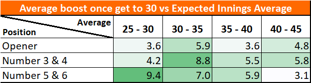
How to prove it though? The proper way would be to show what various batsmen average at differing stages of their innings, against particular bowlers, against both old and new ball, and when the bowler is in their first, second, third spells. That’s not complicated, but would be time consuming, starting from a ball by ball database of Test Cricket. I haven’t done that. Instead, I’ve looked at what happens to a batsman’s average once they are “in”. Previous analysis tells me a batsman is fully in by the time they are 30 not out.
Fig 1 – difference between Runs scored and Expected Innings Average once a batsman has got to 30 runs. This is the boost to someone’s average once they have “got their eye in”. Split by batting position. Expected Average is career average, adjusted for home advantage, innings number, ground. Test matches 2005-2019.
Analysis
The benefit from “getting your eye in” is worth about five runs onto a player’s average (ie. if you average 40, by the time you get to 30* your expected average goes up to 45).
Surprisingly, openers don’t get a further boost once they get to 30. This is odd – by the time an opener is on 30, 20 overs would have gone, the three best bowlers would have bowled six or seven overs and the ball would no longer be hooping round corners. I’ve definitely watched England play, rocking back and forth in my seat saying “if they can just get to 20 overs, see off the new ball, it will get easier. It’ll be all right”. Turns out that was piffle. It gets easier (c.12%), but it’s not a violent swing into the batsman’s favour.
Weaker middle order batsmen get the biggest benefit from getting to 30. I think that’s because they really are the easiest times to bat – 40+ overs into the innings, tired bowlers, etc. In other words, these players aren’t becoming relatively better once they are in – they just tend to be building an innings as conditions become more favourable.
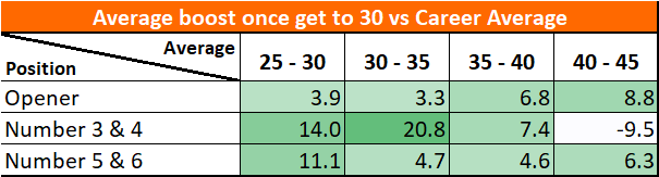
Conjecture
Put the above analysis together, and I’ll give you a second hypothesis – collapses in red ball Cricket are partly because lower middle order batsmen’s averages flatter them. A batsman that averages 30 can make hay in helpful conditions – yet they only average 30. That must mean that they average less than 30 in challenging conditions. Maybe when the going gets tough, the middle order will disproportionately get blown away. Unfortunately for me, that hypothesis doesn’t show up in the numbers. Yet.
Methodology
Since “Expected Innings Average” (EIA) is a non-standard metric, it’s worth explaining what it is and how I’ve derived it, else you’d have every reason to dismiss this as someone fitting the data to match their hypothesis.
EIA was calculated for every innings where a batsman scored over 30. Their runs in that innings (minus 30) were compared to their EIA to get a view of how their average (once they had got their eye in) compared to what one would expect from when they started their innings. Thus Benefit from getting eye in = Runs scored – EIA – 30.
To calculate EIA I started with the batsman’s career average. Then adjusted for the runs per wicket on that ground, then added or subtracted 8.5% depending on Home/Away. To adjust for not outs, I added the EIA to the not-out score.
For instance, when Virender Sehwag scored 319, his expected average was 49 (Career Average) * 1.2 (Ground adjustment for Chennai) * 1.17 (Innings Adjustment – for the 2nd innings of the match) * 1.085 (Playing at home) = 74. Conditions were favourable – but he still exceeded expectation by 245.
In case you aren’t a fan of the above, I also calculated the impact based on raw averages. It doesn’t reveal much. Just goes to show how important the context of an innings is: raw averages are just too simplistic.
Fig 2 – difference between Average and Career Average once a batsman has got to 30 runs. Test matches 2005-2019. Note how much more volatile this chart is than Fig 1. Also that (using raw averages only) numbers three and four appear to have a negative impact from getting their eye in!
Further reading
Michael Carberry’s recent interview in Wisden is linked here.
Here’s a proper statistician’s view of the early stages of a batsman’s innings – Bayesian survival analysis of batsmen in Test cricket. Note how low effective averages are when a player is on less than ten. A far more pronounced effect than I had expected.
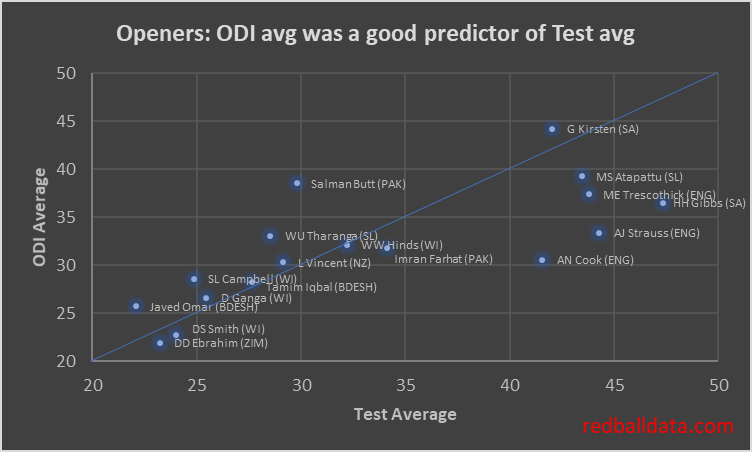
Wind the clock back. The good old days. Specifically the noughties (or 2000s, or whatever). An opening batsman fulfilled the same role in Tests or ODIs. Hence their ODI and Test averages were similar, and you could use one to predict the other with a fair degree of confidence.
Fig 1 – Averages of openers to have played >20 innings in Tests and ODIs from 2000-2009
The correlation is so good that the names get all jumbled up on the straight line running from (20,20) to (50,50). Yes, there’s some Test specialists there (Cook, Strauss) but most of the 23 players that meet the criteria for inclusion behave as expected.
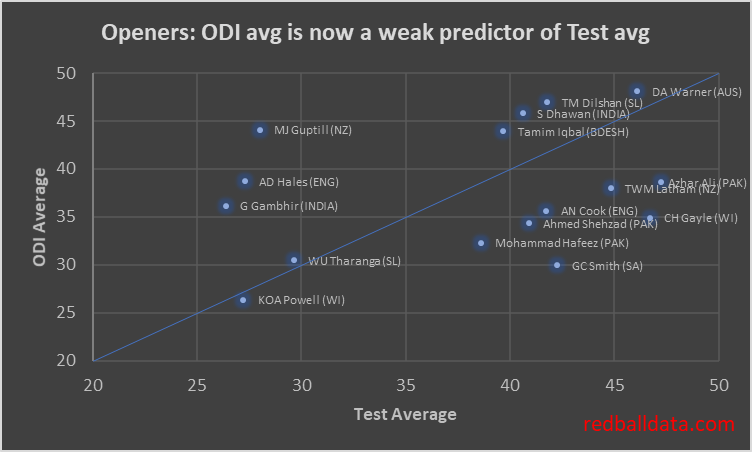
That correlation has broken down now.
Fig 2 – Averages of openers to have played >20 innings in Tests and ODIs from 2012-2019. Note the same axes as Fig 1.
There are three distinct types of player, reflected in the clustering in the chart:
Versatile elite batsmen (Warner, Iqbal) – just as good in either format, average over 40 in both.
Test specialists (Latham, Azhar Ali) – who are/were good enough to play in ODI Cricket, but averaged at least five lower in ODIs
ODI specialists (Hales, Guptill) – averaging under 30 in Tests.
I’m reminded of the film Titanic (1997) explaining the captain’s complacency: “26 years of experience working against him”. That line stuck with me – it’s easy to assume past trends will continue, and that you can use opening the batting in ODIs as a pathway into opening in Tests.
Not any more. Unless the player is good. And I mean really good, the best predictor I can see for successfully opening the batting in Tests is successfully opening the batting in red ball Cricket. Think about Jason Roy – ODI Average 43 as an opener, Test Average 19. I don’t think anyone is now expecting him to average 35 in Tests as an opener. Yet someone must have thought he could, else he wouldn’t have been picked.
redballdata.com – closing the stable door after the horse has bolted!
PS. This piece serves as another reminder to me to continually check that the trends I’ve seen still hold – else one day I could be the mug taking Fig.1 to a meeting, persuading everyone to pick the best ODI openers to open the batting in Tests.
In this piece I’ll look at which grounds are best for red ball batting, and use that to see what impact that has on averages: how much of a boost do Surrey’s batsmen get from playing at the Oval?
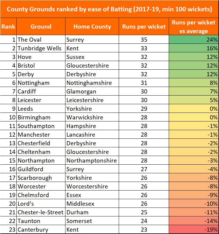
Fig 1 – County grounds ranked according to runs per wicket in County Championship matches over the period 2017-19. Grounds where fewer than 100 wickets fell in that time are excluded.
So what?
Beyond it being a spot of trivia, I can immediately see two reasons why this matters.
i. High scoring grounds harm the county’s league position
In County Cricket there are 16 points for a win, 5 for a draw and none for losing. A win and a loss is worth 16 points, while two draws is worth 10. Drawing is bad*.
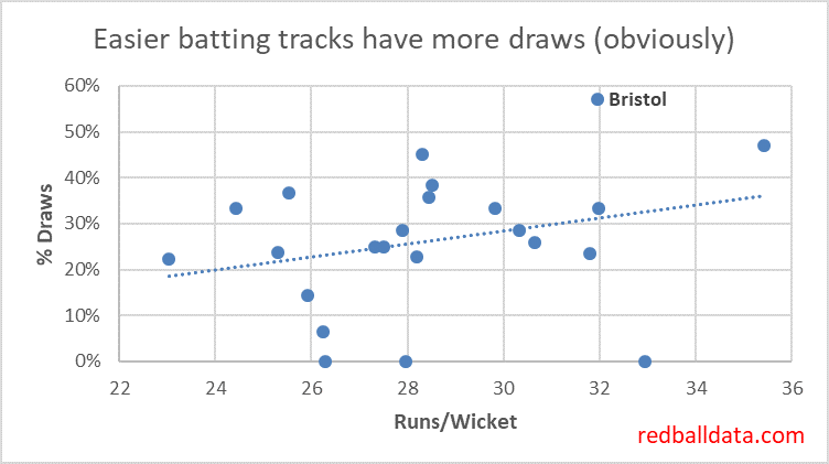
Fig 2 – Runs per Wicket in the County Championship over 2017-19 plotted against the Draw percentage for that ground. Higher runs per wicket are associated with more draws.
And yet there are teams producing high scoring pitches, boosting the chances of a draw, and reducing their chances of picking up 16 points.
Compare Gloucestershire’s two home grounds since 2017: at Bristol (32 Runs per Wicket), W2 L4 D8. Cheltenham (28 Runs per Wicket), W4 L1 D2. Excluding bonus points, Cheltenham is worth an extra 5.4 points per match. While that’s an extreme example, and the festival only takes place in the summer months, there’s still the question “why make Bristol so good for batting”?
Maybe a deeper look at the data will reveal why Gloucestershire and Surrey don’t try to inject a bit more venom into Bristol and The Oval; for now it looks like an error.
*There’s an exception: a team that is targeting survival in Division 1 might choose to prepare a flat track and harvest batting points plus drawn match points in certain situations. For the other 15 counties, drawing is still bad.
ii. Averages should be adjusted to reflect where people play their Cricket.
When using data to rank county batsmen and bowlers, the one gap that I couldn’t quantify was the impact of how batting or bowling friendly each player’s home county is. With this data we can add an extra level of precision to each player’s ratings.
How would we do that? It would be wrong to simply take the difficulty of a player’s home ground as the adjustment – because there are also away games. The logical approach would be to take the average of that player’s home grounds (50%, weighted by the various home grounds that county uses) and the other teams in that division (50% weighting).
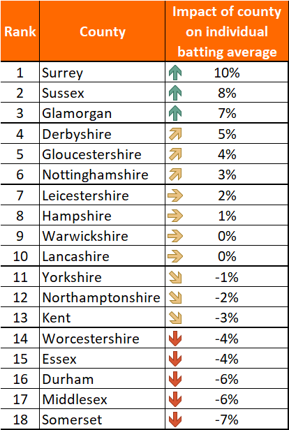
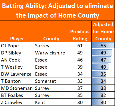
Fig 3 – Impact on batting average from the relative batting friendliness of that county’s grounds (2017-19).
For instance, Olly Pope’s average is artificially inflated by 10% from being based at The Oval. That takes his rating (expected Division 1 average) down to 54.6 from the suspiciously strong 60.7.
Fig 4 – Selected players’ expected averages, now we can adjust for each player’s home county
Equally, Tom Abell clambers up the ranks of 2019’s County batsmen: his rating jumps 7.1% to 35.6 from 33.2. Not an extreme move, but a nice boost to go from 50th to 31st on the list.
This takes us one step closer to a ratings system that captures everything quantifiable. Before next season I’ll adjust the ratings of batsmen and bowlers to reflect this factor.
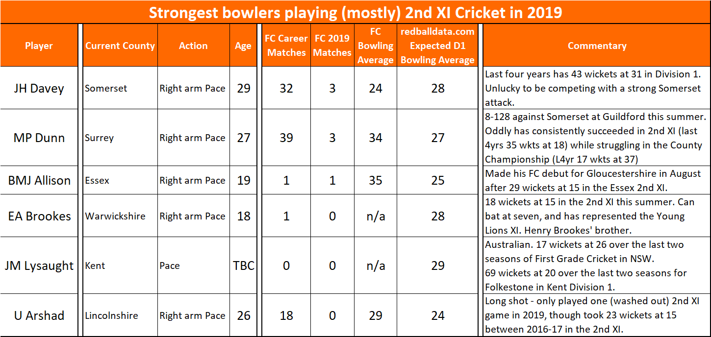
This is my first attempt at something difficult: finding the best players that aren’t regularly playing County Cricket, but that are good enough to do so. In theory there shouldn’t be very many players like this – because counties will know who their best players are.
I’ve used my database of bowling performances from 2016-19 in County Championship and 2nd XI Championship Cricket and picked out six that have promising data.
Time will tell how many of these players get regular first team cricket (and succeed) in 2020.
Fig 1 – Strongest bowlers that played three or fewer County Championship matches in 2019.
I’ve looked at players that have been selected for no more than three County Championship matches in 2019, for reasons other than injury.
Note that England’s Matt Parkinson only played four games for Lancashire in the 2019 County Championship, so might have made it onto a list like this, but he is unlikely to be under anyone’s radar now he’s in the Test squad.
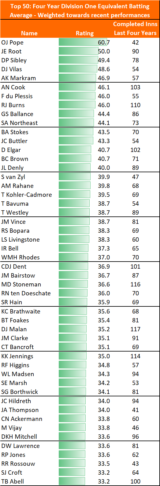
This page contains expected County Championship Division One batting averages for all County Cricketers to have i) played during 2019; and ii) batted in at least 20 completed innings since 2016.
Performances in the Second Eleven Championship, County Championship and Test Cricket are included, though each performance is weighted according to the level being played at (so averaging 30 in Test Cricket is much better than averaging 40 in the Second Eleven Championship).
To give a better indication of current ability, and to partly adjust for age, ratings are weighted more heavily towards recent performances.
Ratings are shown if each player were playing in Division One – this ensures bowlers are compared on an apples-to-apples basis.
This version includes matches up to 29th September 2019. For an update, see the 2021 County Championship preview, which contains much more information about each player.
Top batsmen
Fig 1 – Top 50 Batsman in 2019 County Cricket. Min 40 completed innings since 2016.
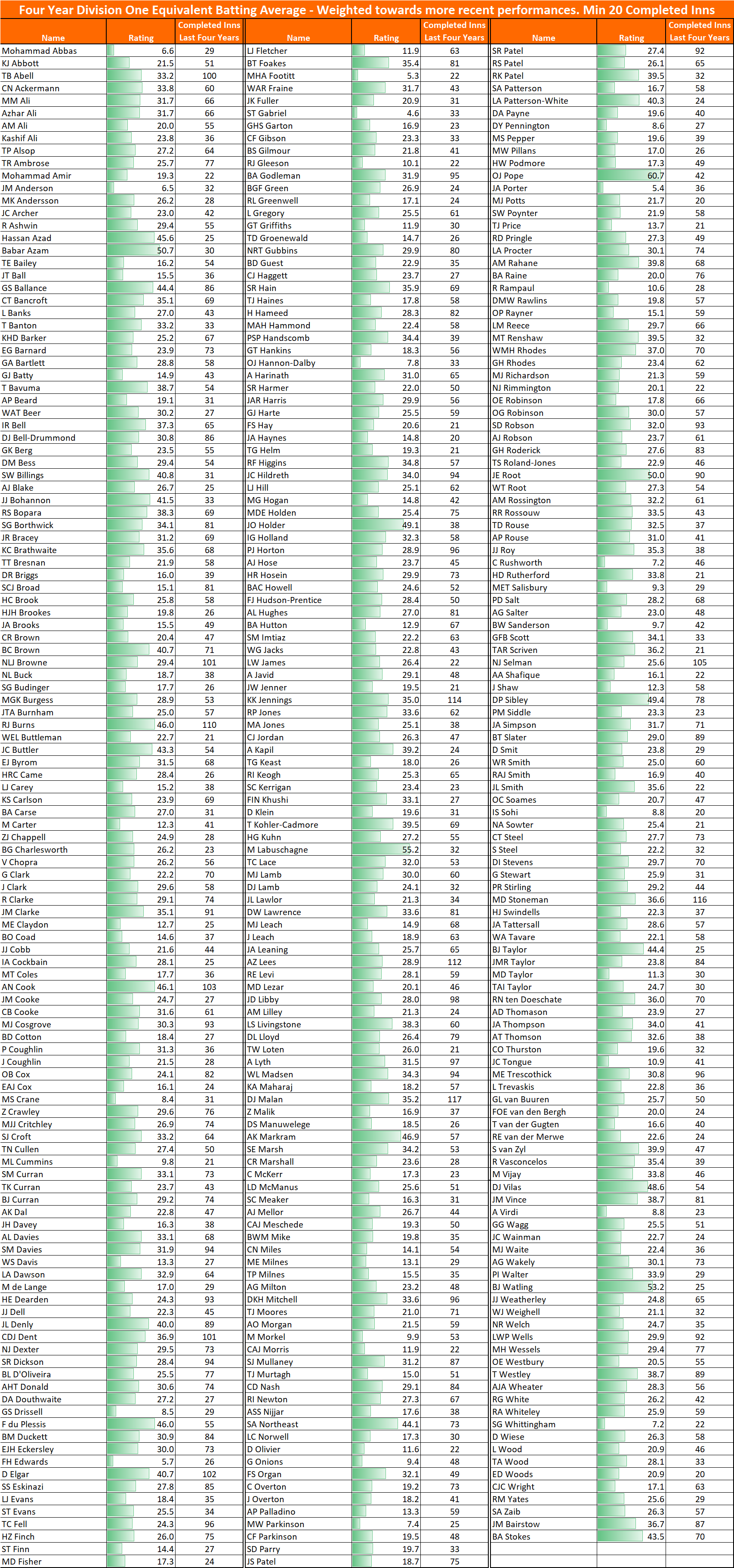
Full list
Fig 2 – All Batsmen in 2019 County Cricket. Min 20 completed innings since 2016.
Key findings
Zak Crawley is an odd Test selection
Expected Division 1 average under 30
Only averaged 34 in 2019, after averaging 32 in Division 2 in 2018.
Even separately adjusting for age (he’s only 21), it’s hard to argue he’s currently better than Dent & Rhodes.
Ollie Pope is practically too good to be true
Expect his average to come down – he can’t possibly have an expected average exceeding 60.
Only 42 completed innings – barely a sufficient sample size to be included in the top 50 players.
Still, he’s easily worth a Test place.
Very few English batsmen are capable of consistently averaging over 40 in Division 1
Cook, Ballance, Northeast and Brown are the four England qualified batsmen who would be more likely than not to average over 40.
There’s more decent English openers than you may have been told elsewhere
Keaton Jennings, Mark Stoneman, Chris Dent and Will Rhodes could cover Burns and Sibley. And, if he could be coaxed out of Chelmesford, Cook.
England selectors might well be relieved that Cook has retired – imagine having to choose two out of Cook, Sibley and Burns to open the batting.
What do you think?
No doubt there’s plenty of themes and trends from the data that I’ve not mentioned – please do drop me a line through the contact page or @edmundbayliss on Twitter and let me know what you think.
This is a pretty basic three-card-trick, in which I’ll make the case that T20 batting has harmed Test averages.
In summary, batting techniques began to adapt earlier this decade so a T20 strike rate of 130 was low risk, then ODI batting adopted those techniques, and finally Test players became unable to adjust between three formats. It’s just one possibility, and I’m aware that correlation is not the same as causation. Don’t worry, there’s charts behind the opinions!
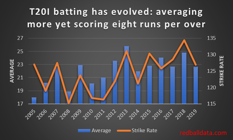
1.Evolution of T20 batting 2011 – 2018
Firstly, high-risk fast-scoring T20 batting has become lower risk. Wisden reckons it’s because teams are getting better value out of the same number of attacking shots (ie. cleaner hitting, not just playing across the line – see Kumar Sangakkara’s description in this video). A precis: “It’s never just wild swings”.
Fig 1 – Runs per wicket and Strike Rate by year in T20 International Cricket. Note how the Strike Rate in 2005 was 127, but batsmen needed to take risks to do it: averaging just 18 runs per Wicket. By 2018 that average was over a third higher.
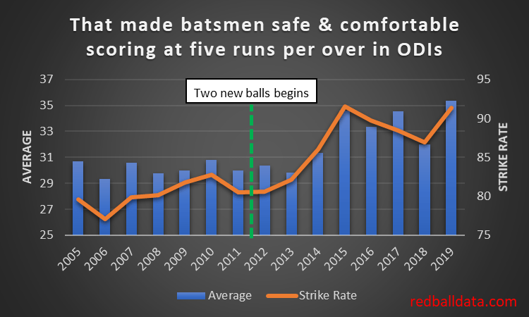
2.ODI batting follows the trend 2015 – 2018
ODI Cricket batting then became more like T20. There’s good reason for this – the optimum strategy for maximizing runs in ODIs became to select T20 players and ask them to score a little more slowly, rather than pick Test players and ask them to score 50% faster.
Fig 2 – Runs per wicket and Strike Rate by year in ODI Cricket (Test teams only). The big jump came after 2014. An aside – there has been focus on how England revolutionised ODI Cricket after their failure at the 2015 World Cup. The above chart shows that that is back-to-front: whatever revolution happened in ODI Cricket happened between 2013 and 2015, then England fixed English one day Cricket.
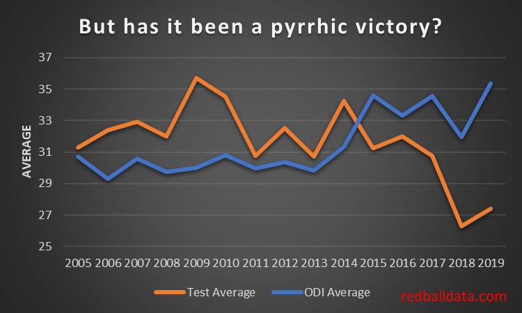
So far, so good. T20 batting has made ODI’s more interesting. What has it done for Test Cricket?
3.Test Cricket stumbles
Fig 3 – Evolution of Test and ODI averages since 2005.
Sadly, in all the upheaval, Test Cricket has lost its way.
2015 was the tipping point – it became easier to bat in ODIs than Test Cricket. The real slump has been 2018 & 2019- a paltry 27 runs per wicket.
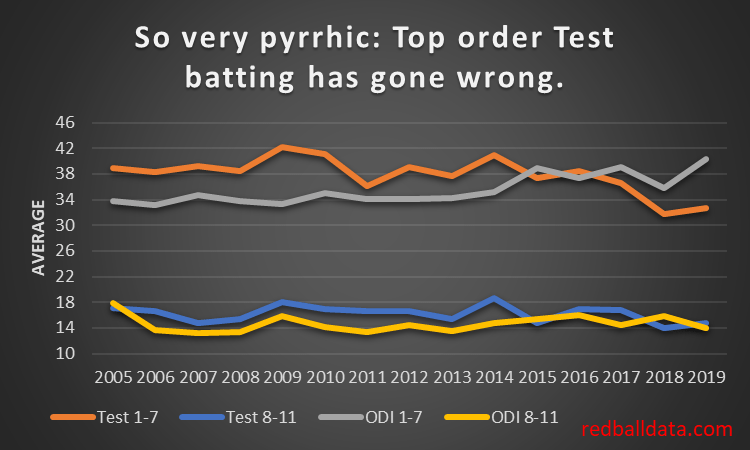
Let’s explore the drivers behind Test batting’s malaise. Firstly, top order batting is the main factor – tail enders are immune:
Fig 4 – Evolution of Test and ODI averages, splitting averages between batsmen 1-7 and 8-11.
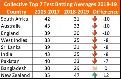
Remember the good old days when 38 seemed like a mediocre Test average? That petered out in 2016. Somehow averaging 33 over the last couple of years has been normal. Yuk.
The worst thing? Whatever this disease is, pretty much every team has caught it. Top order Test batting has fallen by the wayside. Test teams are scoring no faster, but averaging less. Hopefully that’s a short term effect caused by the 2019 World Cup. Hopefully.
Fig 5 – Top Seven batsmen, collective average 2005-2017 and 2018-19, plus the difference between the two. Congratulations to NZ for improving and an honourable mention to Bangladesh who have gamely stood their ground. Note that all teams played at least 11 Matches over 2018-19, so with over 100 completed innings for each team we have a decent sample.
Now, I’m not an expert on the technical side of batting – so I won’t try to cover it. A couple of examples though: seeing Jason Roy failing to cope with lateral movement in the World Cup final was alarming. Even more so, watching Bairstow shrink from a world class batsman to one that can’t seem to stop walking past the ball when defending.
Where do we go from here? Some Recommendations to turn the tide:
Be willing to separate Test and ODI/T20 batsmen*. Only some will naturally bridge the two squads.
Don’t combine ODIs and Tests in the same tour – these are now different disciplines, give players clear windows devoted to the red and white ball games.
Selectors at First Class and Test level would see benefit from picking ultra-low strike rate batsmen at the top of the innings. There will be white ball specialists in red ball teams (there aren’t enough red ball players to go round) – thus these players need to be protected from the best bowlers and the new ball. For example, County Championship winners Essex had Westley (Strike Rate 48) and Cook (SR 45) soaking up the tough conditions.
*I use the word batsmen deliberately: none of this analysis has included the women’s game, therefore there is no evidence to suggest the same conclusions are appropriate.
Appendix
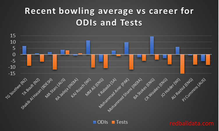
A query comes from @mareeswj on Twitter – “Are test match bowlers getting better or the batters getting worse“
To assess how bowling has changed in recent years, one needs to look at the same players’ performances in multiple formats over time. Like in astronomy where having stars of known brightness (“standard candles”) reveals other properties of those stars.
Fortunately, there are 15 bowlers that have taken 15 wickets
in ODIs and Tests both up to Dec-2017, and since Jan-2018.
Fig 6 – Comparing All bowlers that have taken: i) 15+ Wickets in Tests up to 31/12/17 ii) 15+ Wickets in ODIs up to 31/12/17 iii) 15+ Wickets in Tests from 1/1/18 to 28/9/19 iv) 15+ Wickets in ODIs from 1/1/18 to 28/9/19
Pretty consistently, they have recently averaged a lot less in Tests (mean reduction in average of 7.6). It’s a slightly more mixed view on ODIs (mean increase in average of 2.8 runs per wicket).
Trying to keep an open mind, what are the possibilities?
Bowlers have focused on red ball cricket
Batsmen have focused on white ball cricket
Pitches are becoming flatter in white ball cricket and spicier in red ball cricket
Ball / umpiring / playing condition changes.
Personally, only #2 feels plausible to me, with the others being secondary effects.
How does “getting your eye in” differ between Cricket’s formats? One way to measure it is through the proportion of ducks: more ducks implies it’s harder to get started.
An academic paper was brought to my attention recently. The article focused on ranking Test batsmen across eras, though what I got out of it were the ideas stimulated by reading through the full methodology. I added three entries to the “Blog Ideas” note on my phone. The first of these follows.
The
academics needed to adjust for the disproportionate number of ducks in Test
Cricket relative to a Geometric progression. How disproportionate? Ducks are
roughly two-and-a-half times more frequent than theory would suggest. It’s hard
to get one’s eye in.
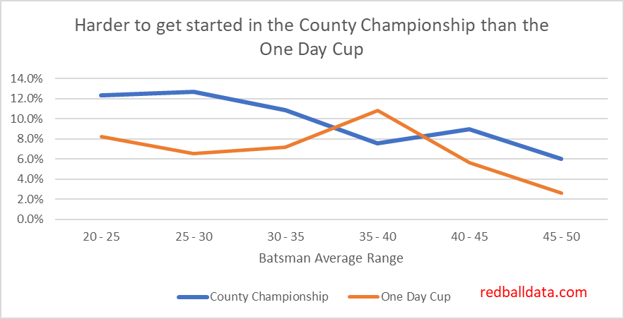
What about the difference between red and white ball duck frequencies?
Fig 1 – Proportion of Ducks in Test Cricket vs Average (Top six batsmen only). Note how much more frequent Test ducks are relative to ODIs. Fig 2 – Proportion of Ducks in the 2019 County Championship vs One Day Cup.
There’s an apparent contradiction here: in limited overs Cricket there is pressure to score from ball one, which should carry more risk – yet it’s easier to get off the mark in ODIs than in Tests. For batsmen averaging 35-40, in ODIs 6.8% of innings are ducks, while for Tests 7.5% of innings are ducks – a 10% greater frequency.
The only
explanation I can offer is the defensive mindset of fielding captains in ODIs.
Conclusion: Bring the field in and have more catchers when a batsman is on nought in ODIs. I know it then looks weak to change the field after a couple of balls – but there is a clear opportunity.
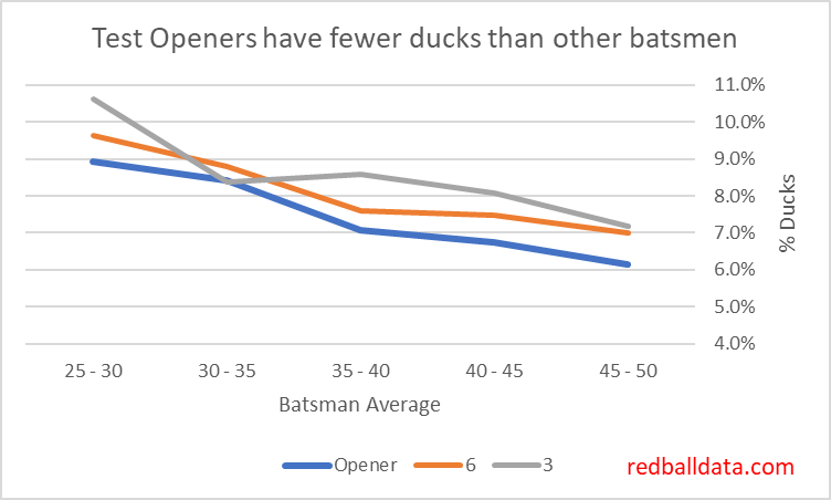
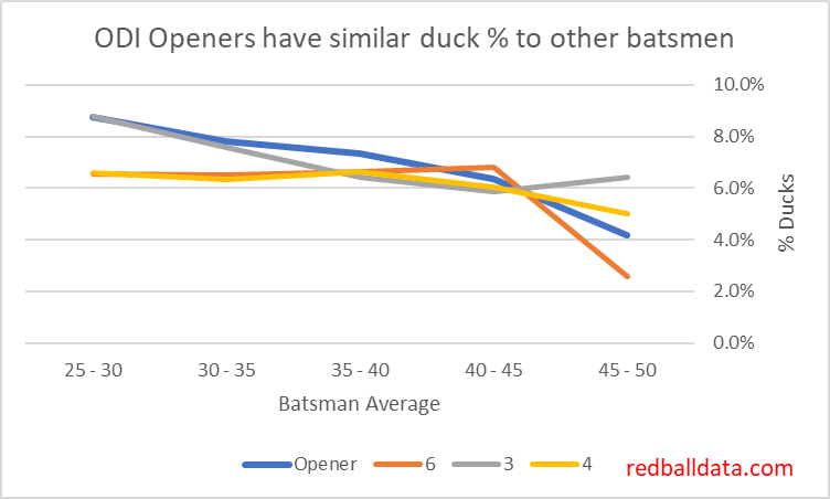
Post Script: Opening the batting is easy
It should
be harder to get off the mark in difficult conditions.
It should
be that openers get out on nought more often than middle order batsman (if they
have a similar average). Yet the opposite is true.
Here’s
the chart:
Fig 3 – Proportion of Ducks in Test Cricket vs Average by batting position. To avoid cluttering the chart, I’ve not shown the lines for batsmen four or five. These are broadly in line with the ratio for openers (yes, that makes for a slightly less interesting chart).
I think this is because openers face very attacking fields, with lots of slips, so any bat on ball should find a gap (as long as you aren’t out caught!)
Comparing
this to ODIs gives a sense of how openers stand out in Tests
Fig 4 – Proportion of Ducks in ODI Cricket vs Average by batting position.