The kids aren’t alright

Let’s look at the English First Class matches between Universities (technically the six University Centres of Cricketing Excellence) and Counties. These are vastly mismatched. The 2019 results make depressing reading for fans of university sport: UCCEs played 18 won 0 drawn 11 lost 7. County batsmen averaged 52 runs per wicket, while the students managed a paltry 15. If the UCCEs had been playing in the County Championship, they would have picked up a mere four batting points in over a season’s worth of matches.

It’s quite telling that over the last three years, only three student bowlers came out averaging under 35.

Fig 1- UCCE bowling performances against Counties in First Class Cricket, 2017-19. Overall bowling figures aggregated by player

Let’s not beat about the bush – the Universities were hazed by Counties that weren’t even at full strength. At first glance you might conclude that we can’t learn anything from these matches. Don’t be so defeatist! We have an opportunity to test how much better batsmen become when competing against players from a couple of rungs down the sporting ladder. It has always puzzled me: what should I model when an average player faces great bowling?

The method I’ve used is to compare individual batsmen’s performances in University matches against expected performance in County Championship Division 1. Since there aren’t that many University matches, we’ll need to group players by expected average to get meaningful sample sizes. We will also use three years’ worth of matches.

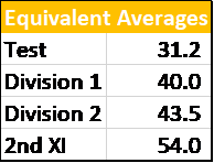
For the expected averages of each County batsman I’ve already done the legwork- see https://twitter.com/EdmundBayliss/status/1112335412658401280 and https://twitter.com/EdmundBayliss/status/1108509473591775233.

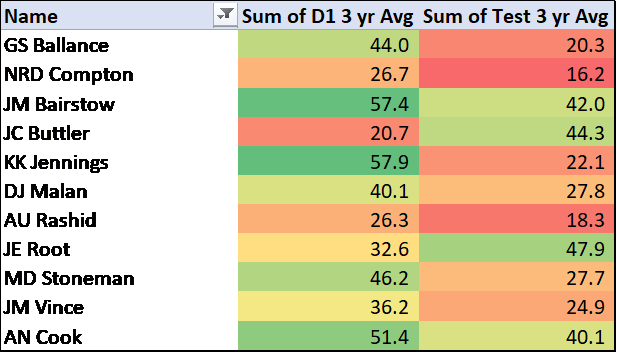
Here are the results:

Fig 2. The orange line represents the expected averages for each group of players (eg. “Very Low” are players who average below 20). The blue line shows the average vs Universities for that cohort, while the Grey bar (right hand scale) shows the ratio between actual and expected average.

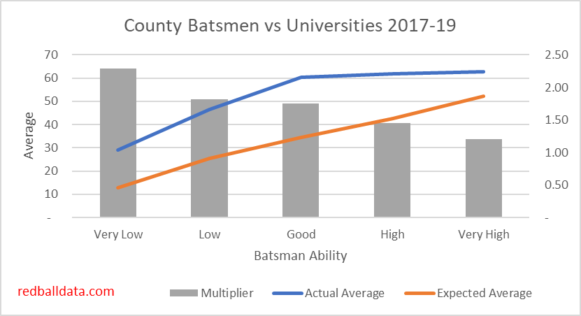
Some interesting findings:

  • Overall “multiplier” (ie. boost to batsman’s average from facing University level bowling) 1.73 – a batsman who averages 30 in D1 would average 52 against UCCEs.
  • The University matches can distort First Class averages, especially for players with limited Caps. For instance, George Hankins averages 25 in FC Cricket, but strip out University matches and that drops to 23. Ateeq Javid’s 25 also drops to 23 when you exclude the 143 against Loughborough. Thus “First Class” average is reliable for county regulars, but fringe players will play a higher proportion of their innings against students. In these cases, “First Class” average should be disregarded in favour of a blended measure of County Championship & Second XI matches.
  • Batsmen with the lowest averages get the biggest boost– this could be because County Cricket pits them against deliveries which they aren’t good enough to defend. Put them against easier bowling and their technique is up to it, so they flourish.
  • Both the “Good” batsmen (who average 30-40 in D1) and the “Very Good” batsmen become excellent averaging 60+ against Universities. Why the plateau at 60? This is possibly caused by batsmen that “Retire Out”– which will affect the highest scoring (ie. best) players more. The concept of “Retired Out” is another reason UCCE matches distort FC averages.
  • Players ranked “Good” or above scored 29 hundreds in 131 completed innings. That’s a Century every 4.5 innings. Quite a mismatch between bat and ball.
  • It’s hard to appraise fringe County players, because of the low number of matches played. Ideally, scores from the University matches could be incorporated into my database in the same way 2nd XI matches have been (by adjusting for the difficulty of the opposition). However, the above tells us that the standard is too low and variable – so disregarding the data is the safest approach. This means that raw First Class averages are potentially suspect, and county selection should not be based on performances against the Universities – no matter how tempting it is. A fine example of selection being driven by University matches is Eddie Byrom being picked by Somerset on the back of 115* against Cardiff UCCE. He made 6 & 14 against Kent, and hasn’t played since.

Conclusion

Based on the above, there’s no evidence to say that top batsmen become impossible to get out when they play against weaker bowlers. A reasonable approximation is that Division 1 batsmen would average 72% more when playing against Universities.

When modelling expected average for a given batsman and bowler, the following rule of thumb is sufficient: Expected average = (batsman average / mean batsman average) * (mean bowler average / bowler average).

PS. Fitting the University Matches into the English summer

What place do the UCCE matches have in the cricketing calendar? Tradition is important. Personally, I would like these matches to continue. What’s needed is a window where the best players are unavailable (as these matches are of limited use to them).

In their wisdom, the ECB have established a 38 day window called “the Hundred”. I propose a change to the calendar – instead of the University matches, the 50 over competition should be the curtain raiser for summer. Half the group games could take place in early April, with the other half happening at the start of “the Hundred” window. This would be followed by two weeks of UCCE matches.

This would ease some of the congestion in the fixture calendar, and make a more logical use of county squads and grounds while we wait for “the Hundred” to finish. It would also mean full strength squads playing some 50 over Cricket, so England have some chance of being competitive in future World Cups.

Home Advantage in Test Cricket

Home advantage exists across many sports, and Cricket is no exception. Each sport has its own factors driving home advantage (1).

It’s a fascinating theme, and I plan to explore it via a series of posts, building a picture of Home advantage in Test Cricket.

In this first piece we’ll start with the magnitude of home advantage, and look at how teams fare at the start of a series in this era of condensed tours with limited match practice.

Measuring Home Advantage

So how big is home advantage? Eight of the last ten Ashes series have been won by the hosts. Casting the net a bit wider, including all Tests since 2000, we can be a bit more precise and measure home advantage a number of ways:

Figure 1: Five measures of Home Advantage. All figures presented from the home team’s perspective. Tests since 1st Jan 2000, excluding Zimbabwe, Bangladesh, Afghanistan & Ireland

The key metric is the 14% difference in runs per wicket between home and away teams. All other effects are a consequence of that. Take a player with a theoretical average of 35 – at home he’ll average 37.4; away that drops to 32.6. Over the course of an average match the 17% difference translates to a 63 run total edge to the home team, which in turn means roughly twice as many home wins as away wins in matches & series.

The example of Rory Burns illustrates the effect of Away games: his county stats are excellent, but he has played six Tests, all away, and averages 25. It will take a while for his average to tick up from there, assuming he gets the opportunity. How much easier life could be if he’d started with a home series! I’ll wager that there are players whose careers stalled because they debuted away from home, and were lumbered with averages that would mark them as not-quite-good-enough. At present that’s just conjecture, it’s on the list for me to return to at a later date.

Home advantage gets bigger as a series goes on

My intention was to look at series of 3+ Tests and show that tourists were coming unstuck in the first Test (fail to prepare, prepare to fail) and then acclimatising and improving. Easy piece of analysis, right? What follows are multiple attempts to show it, and finding the opposite effect: Home advantage gets bigger as a series goes on

Here’s the Test-by-Test view:

Figure 2: 1st Jan 2000 – 9th Feb 2019, Home advantage in series of at least three Tests. Percentage advantage refers to the differential in Runs per Wicket. Excluding Zimbabwe, Bangladesh, Afghanistan & Ireland. Note the large sample sizes.

Home advantage grows though a series. The increase is insignificant from first to second Test, before jumping for later Tests of the same series. This is marked by a significant decline in away runs per wicket in later Tests in a series. Scoring 2.2 runs fewer per wicket in the later Tests is roughly the equivalent of replacing Tim Southee with a breadstick (in terms of batting contribution).

What does that mean for results? Well, if you are planning to follow your team abroad, you’d be wise to go to the early Tests in the series:

Figure 3: Home Wins increase noticeably for the third (and subsequent) Tests in a series. 1st Jan 2000 – 9th Feb 2019. Excluding Zimbabwe, Bangladesh, Afghanistan & Ireland

Worth noting that the extra home wins later in the series come from both fewer draws and fewer away wins.

Now let’s consider first Test home advantage compares to the rest of that series (by country):

Figure 4: Relative home advantage in the first Test of a 3+ Test series as compared to the rest of that series. UAE not treated as a home ground for Pakistan. Victories by wickets are translated to runs based on the average fourth innings score. Draws are recorded as nil. 1st Jan 2000 – 9th Feb 2019. Excluding Zimbabwe, Bangladesh, Afghanistan & Ireland

Generally, home advantage is actually weaker in the first Test than later matches. But note the ‘Gabba effect in Australia – this traditional series opener is especially suited to players with experience in Australian conditions. That’s the exception – in most cases, home teams have more success later in the series.

Still not convinced? One more chart, and if you’re still not convinced you can give me both barrels on twitter (@edmundbayliss) and tell me I’m wrong!

Figure 5: Home advantage by match of series. 1st Jan 2000 – 9th Feb 2019. Excluding Zimbabwe, Bangladesh, Afghanistan & Ireland

There’s a predictable trend in Figure 5: home advantage has grown over time.

Discussion

Let’s recap – home advantage is worth 12% in the first two Tests of a series, and 18% in the later Tests.

Why should this be? Three hunches:

  • Away teams find themselves behind in the series; selectors panic. Perhaps a 21-year-old batsman get picked, or an unbalanced side is selected in the hope of turning the tide. Keaton Jennings being recalled to replace Foakes (a better batsman) in the recent West Indies tour is a neat example of muddled thinking http://www.espncricinfo.com/story/_/id/25953448/jennings-foakes-england-chaos-two-tests-ashes
  • Modern players don’t spend much time in home conditions, but built their technique there. Playing a lengthy series allows home players to reintroduce tried and tested ways of playing. Away teams don’t have that luxury, and can’t expect to make technical changes mid-series.
  • Fatigue: a small squad gets run into the ground by back to back matches.

So, there we have it – home advantage is significant and grows as a series goes on. More analysis is needed to establish why this is the case.

Further Reading

  1. https://www.theguardian.com/sport/2008/feb/03/features.sportmonthly16 – an excellent summary by Professor David Runciman of home advantage across sports.
  2. For a thought provoking piece of analysis on modern Cricket see Tim Wigmore’s article on Cricinfo http://www.espncricinfo.com/magazine/content/story/912717.html
  3. A summary of recent England tours: comparing the warm up conditions with performance in their first innings https://www.kingcricket.co.uk/lets-take-a-quick-look-at-the-opening-innings-of-some-recent-england-test-tours-and-also-the-warm-up-matches-that-preceded-them/2019/01/29/

Post-Script

Dan Weston (@SAAdvantage) suggested that matches after the series had already been decided could be a factor that hadn’t been taken into account:

To exclude just the “Dead Rubber” games would distort the home advantage effect, because to do so would include only the early matches in those series (probably won convincingly by the home team). The right response is to ignore all matches in a series where that series ends in a “Dead Rubber”.

Figure 7: Home advantage measured in runs, both including and excluding series that are decided before the last match of the series. Note that excluding the one sided series reduces the sample size to roughly 300 Tests- so there’s a bit more volatility between first and second Tests in the series. This is likely to be by chance, rather than a genuine effect.

Excluding one-sided series shows lower home advantage (because it excludes big home wins when a visiting team can’t compete with a superior host team). The overall effect is the same though- home advantage gets markedly bigger in the later Tests.

Tenth wicket partnerships: Monsters and Modelling

Sri Lanka won a thriller last week (link), chasing down a target of 304 with one wicket in hand. The unbroken last wicket stand of 78 came out of nowhere. If they had been opening the batting for England, this would have been the ninth highest of the last 100 partnerships.

How common are these monster scores?

Considering tenth wicket partnerships since 2000, the Mean score is 14.5 runs, the Median eight, and the mean duration is 25 balls. The chance of scoring 78 or more is roughly 100-1. [1] 

Figure 1

That tells us that very high scores are rare, but what about the big scores – are there any patterns here?

  • Bias towards the first innings of the match
  • Most involve a top order batsman with the number eleven
  • Three blisteringly fast run-a-ball partnerships; most are significantly faster than the average 3.0 runs per over for Test Cricket in this era.
Figure 2

Modelling tenth wicket partnerships

If you have two openers that average 40, you can model the partnership as if it is one batsman that averages 40 – the distribution of scores will be the same. This holds true until you have batsmen with wildly different averages. What would you expect a partnership to yield when a top order batsman is left with a number eleven for company?

A model of expected average for a tenth wicket partnership was created, using the following inputs: each Batsman’s Career Average, Home/Away and the innings number within the match. Various combinations of the two batsmen’s averages were tested against the data since 2000. [2]

Results were tested in two ways. I) Measuring the mean square difference between expected and actual partnership, and II) Seeking a distribution where half the scores are above and half below the expected distribution

The best fit was that the partnership average is: Weaker batsman’s average + 20% of the difference between both batsmen’s averages.

Returning to Sri Lanka’s match winning partnership, Perera (Avg 35) and Fernando (Avg 7) would be expected to average (7) + (35-7)*0.2 = 12.6 for the tenth wicket. Adjust for it being the fourth innings, and being away from home, and the expected average drops below 10. Something else is missing – or that 78 partnership is still a miracle!

Figure 3 – Least likely tenth wicket partnerships

Strategy and Strike Rate

If the number eleven bats defensively, that gives more time for the senior batsman to score runs: the partnership for the tenth wicket is likely to be more lucrative.

Think Chris Martin – he averaged 2.5, but at a Strike Rate of 20 runs per 100 balls. Martin could expect to stick around for 12.5 balls. If he scored at a Strike Rate of 50, he would only last an average of 5.0 balls, and there would quickly be a marooned batsman at the other end.

Ignore Strike Rate and the 84 Chris Martin put on with Tim Southee in 2008 (link) was a one-in-27 million event. Adjust for bludgeoning Southee and circumspect Martin and that drops to 1,500-1.

There is an unquantified boost to the expected partnership through farming the strike to ensure the senior batsman faces more balls. Another increase comes through aggressive batting by the senior batsman. I will consider adding those factors to my Test Match Cricket Model, so it better reflects the reality of occasional monster last stands.

Conclusion

  • Expected value of the tenth wicket: Weaker batsman average + 20% of the difference between both batsmen’s averages.
  • A last wicket partnership is more successful if the number eleven defends, leaving the attacking batting to the senior batsman. If numbers ten and eleven are batting together, they should bat naturally.
  • More very high partnerships than my model expects, driven by attacking batting.

Further reading on batting partnerships

A powerful story, NSFW (because it is something of a tearjerker) https://www.cricketcountry.com/articles/bert-sutcliffe-and-bob-blair-at-ellis-park-a-fairytale-bigger-than-cricket-287471

A paper on batting strategy and partnerships in Tests. Limited in that it covers the general case, rather than a player-specific model. https://pdfs.semanticscholar.org/786b/fa723eb721b66fd6023b4a6f56394968087c.pdf


[1] 100-1 odds for an average last wicket pair. The 600-1 for Sri Lanka reflected the fourth innings, against a fantastic South African bowling attack.

[2] Note that only batsmen with more than 30 career innings were included and matches involving Bangladesh are excluded.

Should Jennings’ expected average be reduced after the Bridgetown Test?

There has recently been interest in Keaton Jennings’ average against pace. Two failures in Barbados have stoked this discussion. His average (26) in 16 Tests is below his expected average (33) based on County performances over the last three years. Generally, I would choose the big sample size (County Cricket) over the smaller sample size (Tests), and so rate his expected average at 33, not 26.

But – can we learn anything about technical flaws from Jennings’ Test performances to change that view? Specifically his average against pace:

Keaton Jenningsaverage against pace (16.90) is the lowest of any opener to have played more than 15 Tests, for games in which ball-by-ball data is available.

Wisden (Jan 26th 2019, via Twitter)

I’ve had a look at his performances over the last 3 years on the county circuit. The hypothesis is that there are some very good pace bowlers in County Cricket, and as an opener Jennings will face them (a middle order batsman might be able to make hay without facing much of the best bowlers).

The data supports this hypothesis – 68% of the time he faces at least one opening bowler with Test experience.

Keaton Jennings has played two of the last three seasons in Division 1, scoring 11 hundreds, and making runs in a variety of conditions (including April and September- when the deck is stacked in the bowler’s favour). His three year average isn’t amazing, but the key point is that one can’t look at the above data and conclude that Jennings has a problem against pace bowling.

As an aside, this piece is a reminder that I need to build a way to combine the Test performances to the First Class performances to ensure I’m using every available data point in appraising batsmen.

Conclusion: There is no reason to model Jennings’ expected Test average as anything other than 33. Plenty of people will disagree with that!

Using CricViz False Shot % as an alternative to Averages

CricViz now use False Shot Percentages as a metric for assessing batsmen. Most recently they have done this as one factor when considering Australia’s options for the Sri Lanka tour.

A key point is that False Shots and averages are not equivalents – if a two batsman both have a 10% False Shot rate, the more attacking batsman will average more because they will score more runs for each error they make. One has to combine False Shot Rate and Strike Rate to get a useful metric.

As such, I’ve used the data CricViz published, and overlaid that with First Class Strike Rates to give an expected average derived from False Shot %

The chart shows that Maxwell leads the options (due to his Strike Rate of >70 runs per hundred balls, combined with a healthy 10.4% False Shot rate. This is interesting because his 3 year Sheffield Shield average was only 43. Worth bearing in mind he isn’t a Red Ball regular, with only 962 runs in the last 3 years.

Handscomb (real world average 50, False Shot average 57) can feel hard-done-by to have missed out on selection. He averages 38 in Tests, it looks an odd choice.

There is evidence that Pucovski is as good as the hype – CricViz’s data suggesting that not only has he performed well (FC Average 49 after 8 games), but that it isn’t a fluke (v.low False Shots implying he may have been unlucky to average only 49 in those 8 matches). Still, it’s a small sample size.

Conclusions: False Shots combined with Strike Rate are a potentially useful tool in predicting player averages when limited data is available (such as young players). However, more evidence is required of long term correlations before False Shot % and Strike Rate replaces averages.

A review of England’s batting options

Eeny meeny miny moe

Anon, Pre-1820

Whinging about selection is part of how I traditionally spend the days leading up to an England Test. It’s my habit, and I’m probably not alone in that.

With the new(ish) England selection panel of Ed Smith, Trevor Bayliss, and James Taylor, whinging about batting selection has been more difficult.

Burns in for Cook? The logical choice. Moeen Ali recalled? Makes sense. Buttler plucked from White Ball obscurity? Not what I would have done (Hildreth or Livingstone), but OK.

Looking for some whinging ammunition ahead of England’s first warm up game against a West Indies Board XI on 15th Jan*, I did some analysis of England qualified batsmen. Specifically, their records in the last 3 years of all Red Ball Cricket (Test to 2nd XI, adjusted for difficulty).

What I expected to see was a clear hierarchy of players, with some of my favourites at the top, and England’s sub-optimal picks somewhere down the list. Actually, the selectors’ choices are supported by the data, and England have a big group of players who are of very similar abilities.

Below I’ve grouped players by expected Test average, based on the last 3 years:

World Class (Expected Average 42+) – Root & Bairstow

Test Regulars (Expected Average 35-42) – Pope, Burns, Ali, Stokes

Plausible Selections (Expected Average 30-35) – Stoneman, Roy, Buttler, Westley, Wells, Jennings, Livingstone, Gubbins, Brown, Ballance, Foakes, Clarke, Hales, Denly, Woakes, Duckett.

Wildcards (Data says Expected Average >30, but reasons to be suspicious)– Northeast: mostly driven by 2016 scores in Division 2. A poor run at Hampshire lately. Hughes: scored 425-3 in 2nd XI last 3 years. Didn’t play a first class game in 2018, only made 209 runs at 23 in the 2018 North Staffs Premier League, so probably safe to rule him out of Ashes contention.

Conclusion:

From a batting perspective, England have chosen well. They’ve picked all the World Class and Regular players (apart from Pope, who only has 32 completed innings, and is on the fringes of the squad). All their other batsmen are from the Plausible Selections bucket. England have a lot of Plausible Selections; it doesn’t really matter which of them they pick. Dropping Buttler for Hales would be worth about 4 runs over the course of a Test. As long as the selectors keep picking players that are amongst the best available, I’ll cut them some slack.

Other Discoveries:

  • England’s batting is weaker than at the start of the decade. England were spoiled by a team with 7 batsmen who averaged over 40 – like this side that beat South Africa by an innings in Durban in 2009. Pragmatically, they use 2 or 3 all-rounders (Stokes, Ali, Woakes) and often use 8 batsmen to do the job that 7 did at the start of the decade.
  • A number of players have been tried that currently average under 30 in Tests: Stoneman, Westley, Jennings, Duckett, Hales, Pope. This analysis indicates that these were good selections, and much of the underperformance is due to chance. An example: Stoneman averaged 28 in 11 tests, against an expectation of 34. But 11 tests is a small sample size, and 7 of those tests were away, including an Ashes series.
  • Bairstow is one of England’s two best batsmen. Dropping him would be an error.

*England’s Squad to tour the West Indies (Batsmen only):

Joe Root (Yorkshire) (captain), Moeen Ali (Worcestershire), Jonny Bairstow (Yorkshire), Rory Burns (Surrey), Jos Buttler (Lancashire), Joe Denly (Kent), Ben Foakes (Surrey), Keaton Jennings (Lancashire), Ben Stokes (Durham), Chris Woakes (Warwickshire)

Test vs County Cricket Averages

“Coach woulda put me in fourth quarter, we would’ve been state champions. No doubt. No doubt in my mind.”

Napoleon Dynamite (2004)

It’s often assumed that we cannot compare Test and first class batting performances – the old comparing ‘apples to oranges’ conundrum. But if we can quantify the relative values of the different formats, we can compare like with like.

Looking at batting performance of players who’ve played across multiple formats in English* domestic cricket (2016-2018), one can assess the relative difficulty of each tier. My analysis found that it’s 19% harder to bat in Test Cricket than it is in Division 1.

If a player averages 40 in Division 1 – the data says you could expect him to average 31 in Test cricket, 44 in Division 2, and 54 in the 2nd XI.

That tells us that you’d need to consistently average over 55 in Division 2 to average 40 in test cricket – hence so few England players being pulled from those ranks in recent years.

It also means that Hildreth (who I’ve previously thought of as an England option as he averages 41 in Division 1) would be expected to average 32 in Tests, and therefore isn’t the batsman we are looking for.

A few examples of 2016-2018 Division 1 and Test averages:

Note that only Root and Buttler underperformed in Division 1 relative to Test Cricket.

At this point its worth going into the assumptions – professionally I’m always keen to show where the data ends and the judgement begins. The data can tell us performances for each player who crosses tiers. Judgement needs to be applied to appraise that data and turn it into a single factor.

Some options:

  • Jonas (@cric_analytics) has looked at minimum 10 innings in both competitors – the downside of this is that it excludes valid data points. For instance, Ben Stokes scored 226 @ 28.3 in D1 in the last 3 years – 10 runs below his test average. That should count to the total, even if it’s a small sample. Jonas reckoned a 20% gap between Test and County cricket – slightly wider than my data suggests.
  • Include all overlap – the risk is that this is skewed by a few high/low scores from one-test wonders against weak/strong opponents. This gives a mere 2% difference between Test and D1.
  • Overseas players included: this gave an 8% gap between D1 and Test – but playing away from home knocks 10% off batting average, so this is not a fair comparison. To put it another way, Pujara playing for Yorkshire averaged 14, because every game was an away game.
  • I have used relative performance for English players with >4 completed innings in each format, and weighted the overall result according to the lower of the completed innings in each format. For instance, Ben Stokes has played 8 completed D1 innings, but 46 Test innings – so the overall result is weighted with a factor of 8 because of Stokes’ performances, while Dawid Malan played 36 D1, 26 Test innings, so is more useful for this exercise and receives a weighting of 26.

Adjusting for the level individuals are playing at, allows comparison of players in different tiers. In future posts I’ll look at some implications of this data:

  1. 2nd XI players with the potential to be First Class batsmen
  2. England’s best available batsmen
  3. Overseas players: who has & hasn’t succeeded – will look at any trends in the data.
  4. It’ll take more number crunching, but I’m interested in linking First Class / List A performance- to see how well correlated they are, and use that to gauge quality of players for which limited data is available (there are a lot of players with a handful of FC games behind them – too few completed innings to fairly appraise them

*I know it’s English and Welsh. Sorry Glamorgan. There isn’t an easy word for English and Welsh, so I’ll use English as shorthand for English and Welsh.