Pace bowlers need rest. The County Championship structure begins with a rhythm of four days on, three days off. I think that’s too much and impacts performance.
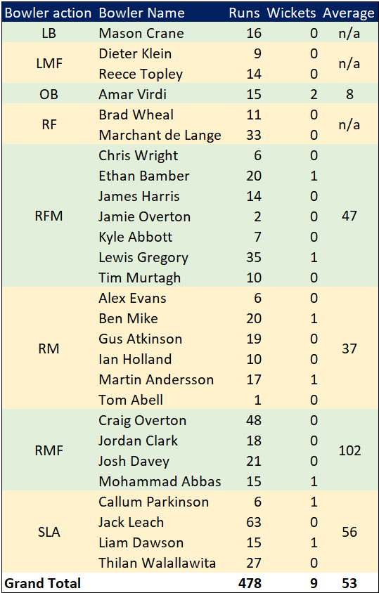
Last week Ryan Higgins bowled 25 wicketless overs. So did Darren Stevens, going at over four an over. There’s more: Chris Rushworth, Jackson Bird, Ajeet Dale, Michael Hogan, Jamie Atkins. All had played three games in 18 days. In the third game their collective figures were 0-506.
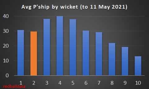
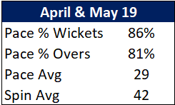
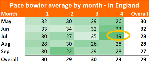
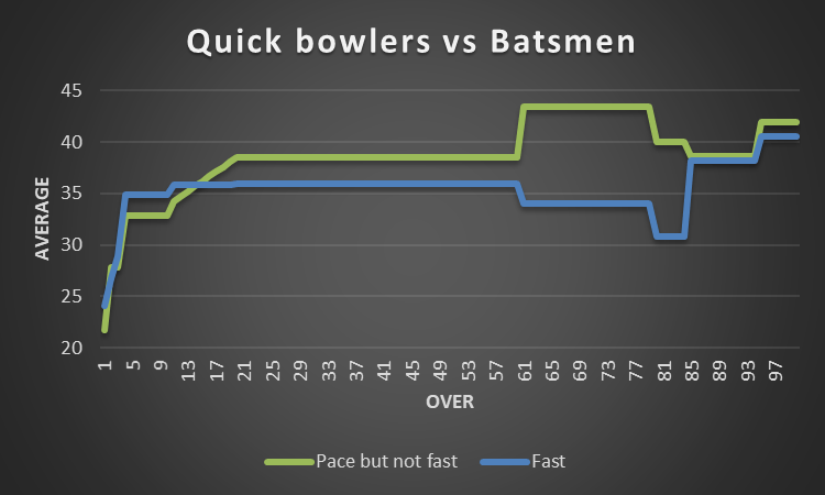
Zoom out. I’ve looked at the pace bowlers who have played all three games this spring, and how they compare to the fresher bowlers that haven’t played all three:
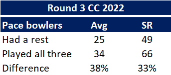
Flipping heck. A 38% difference in average. This is much bigger than when I’ve looked at this before. But then those were just back-to-back Tests (7%), or for short recovery between List A games (5%). This is the harsher concept of back-to-back-to-back. It is, admittedly, just one week I’m looking at – adding the error bars we’re comparing averages of 25 (+/- 5) with 34 (+/- 7). I’d be surprised if the real variance is more like a (still whopping) 15-20%. 38% just feels too high*.
Let’s get into the implications of this:
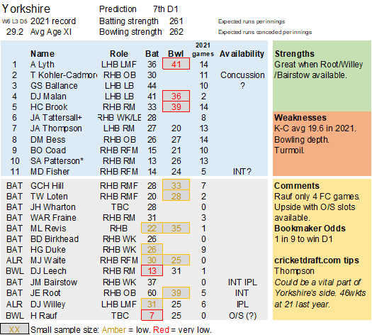
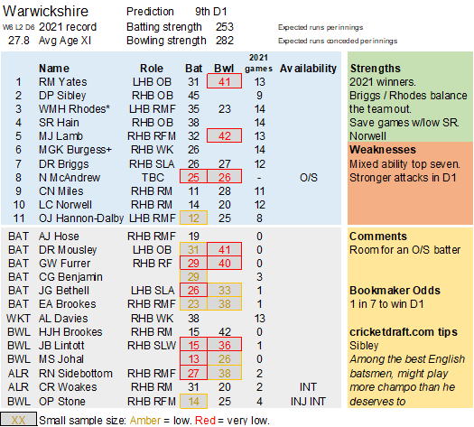
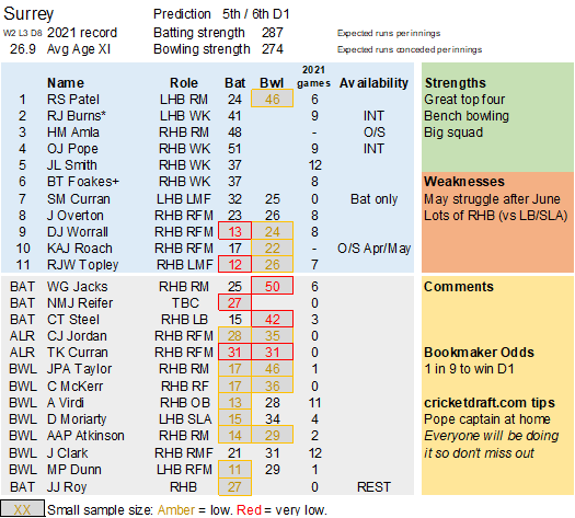
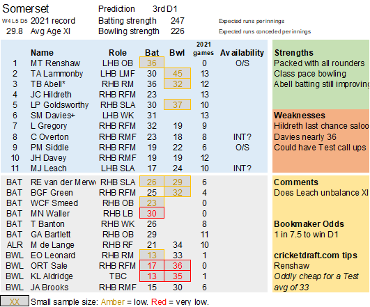
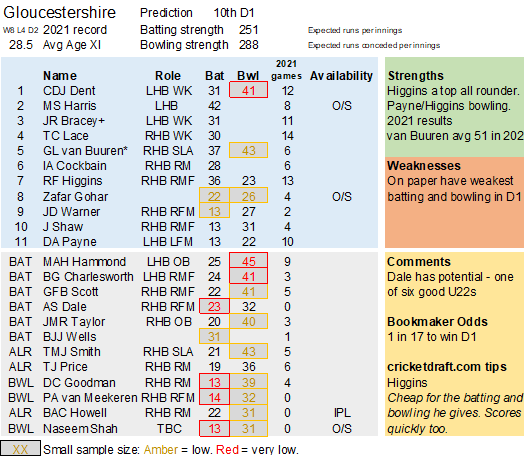
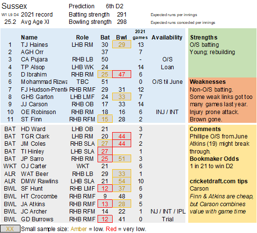
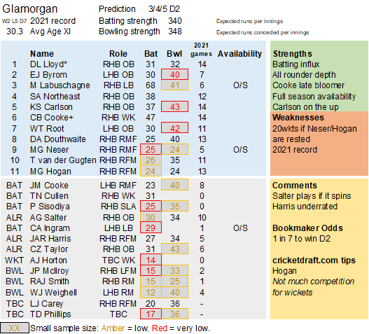
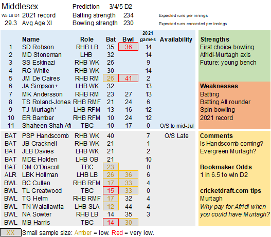
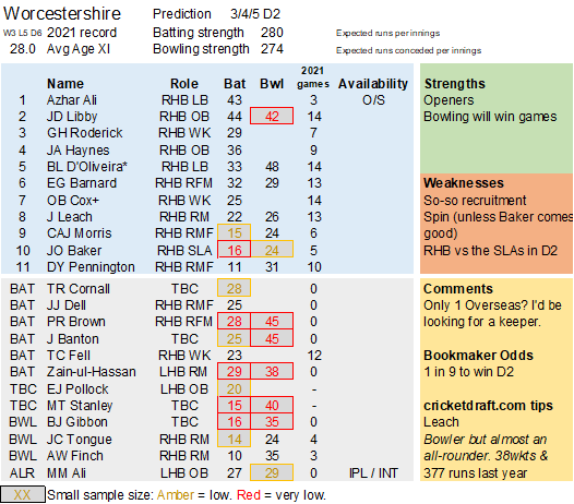
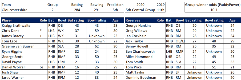
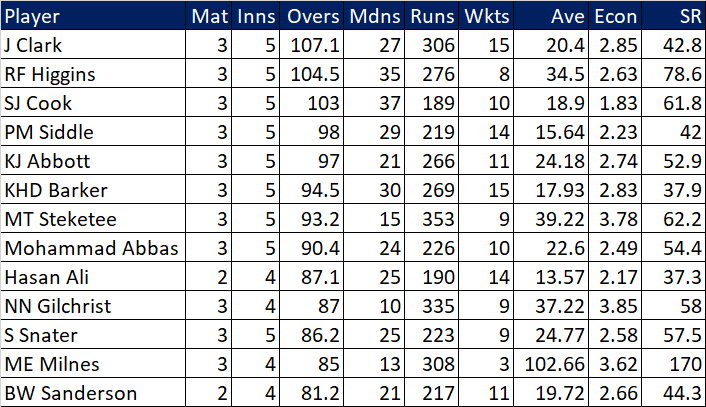
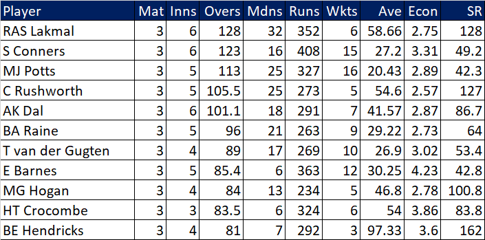
Selection – if the above table is right, then Ryan Higgins (expected average 24) becomes a 33 averaging lump playing his third game on the trot. This means rotation is required. Puts the sides relying on one or two strike bowlers at a disadvantage (like Glamorgan, Derbyshire, Gloucestershire). Here’s the pace bowlers with the heaviest workloads so far – keep an eye on them next week***:
Season Structure – if four-days-on-three-days-off doesn’t work, what about four-days-on-four-days-off? Could start the first game on a Wednesday, the next the following Thursday etc, ensuring games still include weekends.
I’m a traditionalist, but if 14 games per season is damaging the competition, then maybe 12 (in the same window) is better. Standards must remain high. I’ll track and we’ll know more by the end of the year.
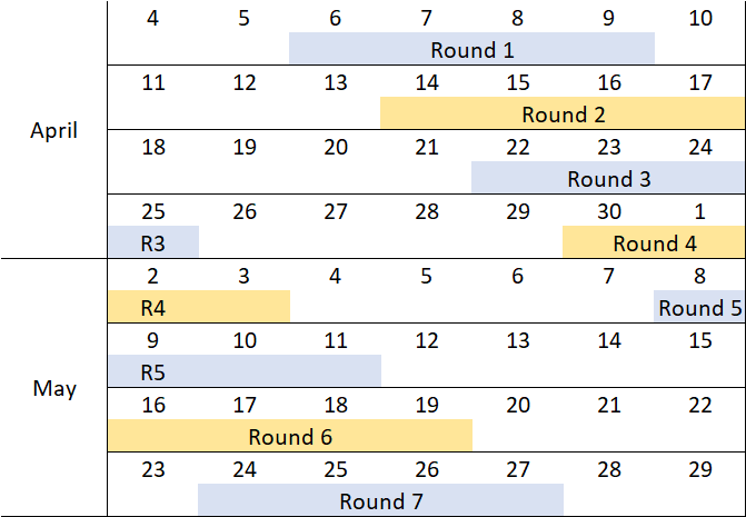
Scheduling – Looking ahead, there are four teams that play all the first six games. Then two (Durham & Leicestershire) are involved in all the seven April/May matches. Quite a disadvantage.
County Stats – is the failure of many recent batsmen to make the step from county to Test because batsmen are having things too easy against fatigued bowlers? Maybe it sounds far fetched, but worse suggestions have been provided.
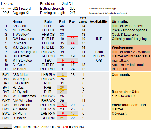
Next steps – The hypothesis is that the knackered bowlers will underperform next week. We’ll see what an extra week’s data says. If I’m right, Essex and Hampshire may struggle.
* Yes, there were lots of top quality fresh bowlers deployed for the third round of games, but this only explains 3% of the gap.
** Lovely weather we’re having. It might be that there’s normally rain and cloud around, giving bowlers more helpful conditions and more rest. Thus (as The Leading Edge Cricket Podcast point out), the Top 6 batter average stands at 40 this year, up from last year’s 31.
***Not all games are equally tiring. Winning by an innings in two days, you get two rest days. A rain affected game is probably as good as a week off. When Hampshire scored 652/6 Abbott and Abbas had their feet up. I still need to think about who has had the best chances to recover.